While preparing a recent lecture about my career, I spent far more time in old folders than I expected. What started as a simple attempt to collect projects and build a rough timeline slowly turned into something closer to digging through an archive: old logo presentations, screenshots from design forums, early websites, award announcements, conference photos, forgotten concepts, and work I had not looked at in years.
The logos were all there, of course. So were the websites, mockups, presentations, and finished pieces. But the things that came back most clearly were rarely the final outcomes. I remembered the situations around them: the client whose problem turned out to be different from the one in the brief, the website migration that quietly erased years of search visibility, the partnerships that began with real enthusiasm and faded once the work became harder, and the deadlines that somehow always arrived at the worst possible moment.
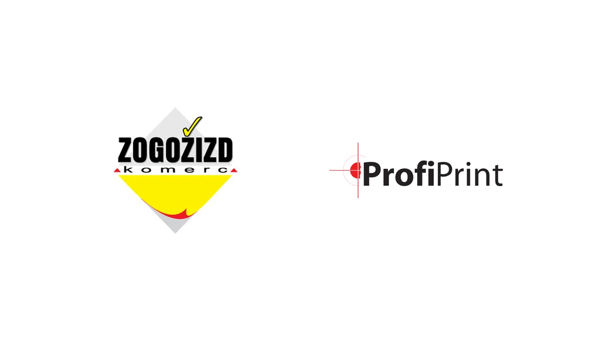
One of the earliest examples was a logo project for a printing company called Zogožizd, a name that still requires a pause even today.
It came from the initials of several family members. It made sense internally, but for everyone else it was difficult to read, difficult to say, and even harder to remember. Like many young designers, I first tried to solve the problem through design. Better typography, better composition, better execution. If the logo was good enough, maybe the name would work.
Eventually it became clear that the logo was not the real problem.
The name was.
The company later adopted the name ProfiPrint, and suddenly many of the communication problems became easier before the logo even entered the conversation. At the time, it felt like a small project. Looking back, it was one of the first moments when I understood that the thing a client asks you to solve is not always the thing that actually needs solving.
That kind of work almost never appears in a portfolio.
A portfolio has to simplify. It has to show the result clearly, otherwise nobody would understand the project without sitting through months of context. The final logo, the key applications, a short explanation, perhaps a few images of the system in use. That is how work is usually presented, and most of the time it makes sense.
But while preparing the lecture, I became aware of how much disappears in that format. Projects that took months of discussions, false starts, revisions, wrong turns, technical issues, and small decisions eventually become a few clean images. The result looks calm. The process rarely was.
One photograph brought that reality back immediately.
It was from the period around my daughter’s birth celebration. I remember trying to finish a project after the celebration because the deadline had not moved just because life had. I was exhausted, not exactly in perfect working condition, and still sitting in front of the computer because responsibility does not always wait for ideal circumstances.
The project was delivered. The client was happy. The work moved on.
None of that context would ever belong in a case study, but it was part of the work. Not in a dramatic way, and not because this profession is uniquely difficult. It is simply one of those small, ordinary collisions between life and deadlines that never appear in the polished version of a project.
Looking back, many important moments in my career were like that. They did not produce attractive images, but they changed how I worked. Losing search rankings after a website redesign taught me more about the boring side of digital presence than a successful launch ever could. Failed or complicated partnerships taught me more about collaboration than projects that went smoothly. Pricing mistakes, delayed payments, unfinished ideas, and projects that never launched all left some kind of mark.
None of this means the finished work does not matter. It does. The logo still has to work. The system still has to hold together. The website still has to function. The final output is what the client uses and what the audience sees.
But the longer I work, the harder it is to separate the visible result from everything that made it possible.
For years I thought visibility was mostly a marketing problem. Better website. Better rankings. More published work. More consistent posting. All of those things matter, especially for an independent designer, and I have learned that lesson more than once.
Still, when I looked back at the projects and opportunities that had the biggest impact, many came from somewhere less measurable: a recommendation, an introduction, a conference, a former client, a conversation that lasted only a few minutes. The work created awareness, but trust usually created the next step.
That was one of the quieter conclusions that came from preparing the lecture.
The projects were the reason people arrived. Trust was often the reason they stayed.
Maybe that is why the title The Mining of Life started to make sense to me. At first it was mostly a joke and a small nod to something else, but after spending time with old projects, the metaphor felt more accurate than I expected.
People see the gold: the logo, the image, the polished presentation, the final result.
What they do not see is the mine behind it: the wrong turns, late nights, technical problems, difficult conversations, small mistakes, lucky breaks, and years spent learning which problems are worth solving.
Those parts rarely appear in a portfolio. They are harder to show, and usually harder to explain.
But looking back, they are often the parts I remember most clearly.
Further down the mine
The original lecture title was, quite shamelessly, borrowed from Monty Python’s The Meaning of Life. While this article offers considerably fewer musical numbers and questionable life advice, it owes more than a little to Python’s habit of examining serious subjects through complete nonsense.
A few favorites worth revisiting: