A four-part mark for premium themes
TrueThemes was a small team that designed, built, and sold premium WordPress themes.
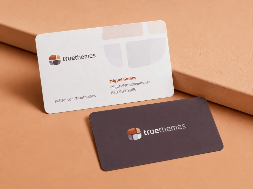
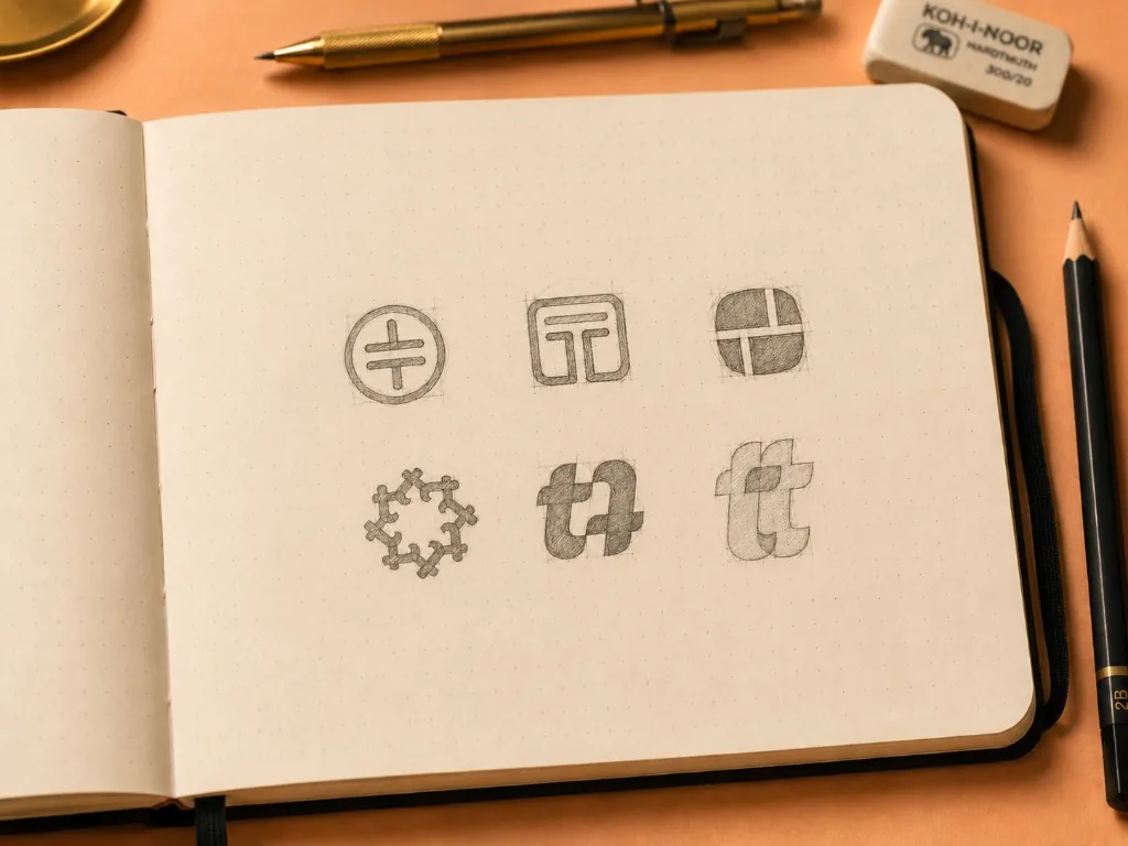
Created in 2011, the identity pairs a standalone four-part symbol with a geometric wordmark. Five directions were explored before the client returned to the original concept for its balance of form, type, and color. The same geometry carried into a set of rounded-corner business cards.
Building something meaningful?
Currently available for select identity and digital brand projects.
Discuss a project