A clearer mark for accelerated learning
Redesigned for Training Camp, an IT certification provider delivering intensive programs for individuals and organizations.
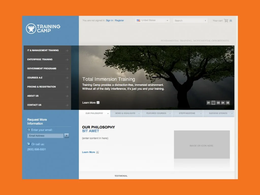
The new identity moved the brand away from a sports-led visual language toward a clearer expression of intensive technology education. A structured wordmark and abstract flame symbol created a more focused and adaptable system.




From athletic speed to focused learning
The original logo used an italic wordmark, a running figure and a tagline to communicate speed and performance. The redesign replaced that literal sports metaphor with a structured wordmark and an abstract flame, connecting the energy of intensive training with the idea of a campfire.
Building something meaningful?
Currently available for select identity and digital brand projects.
Discuss a project