Turning an S into a path to growth
The Sod Agency provides marketing and specialized software solutions for sod producers, with a new brand strategy, logo and visual identity developed in 2024.
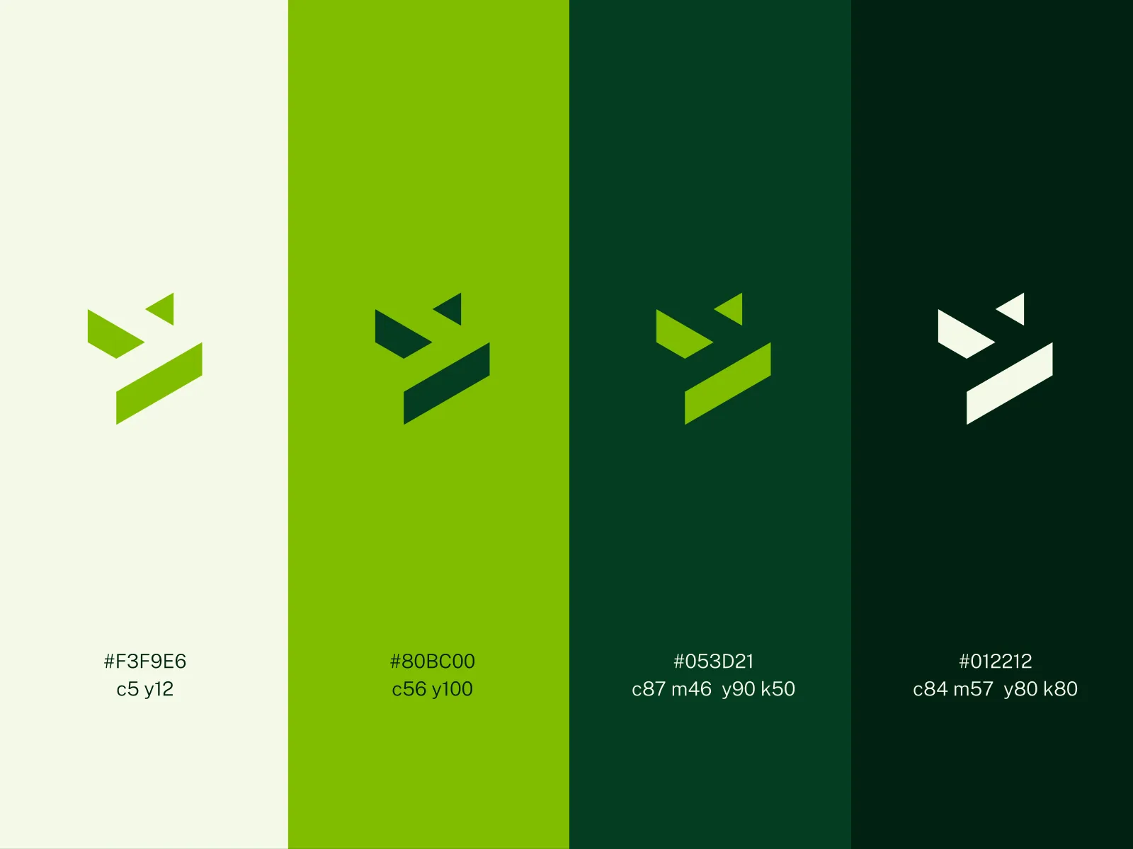
The selected direction turns an S into a compact geometric mark referencing landscaping, growth and forward movement. The identity extends across primary, secondary and compact lockups, supported by a focused green palette.

Building something meaningful?
Currently available for select identity and digital brand projects.
Discuss a project