A mark still at home
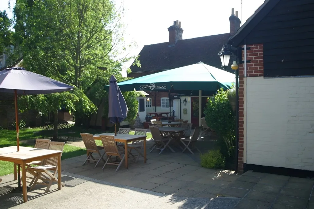
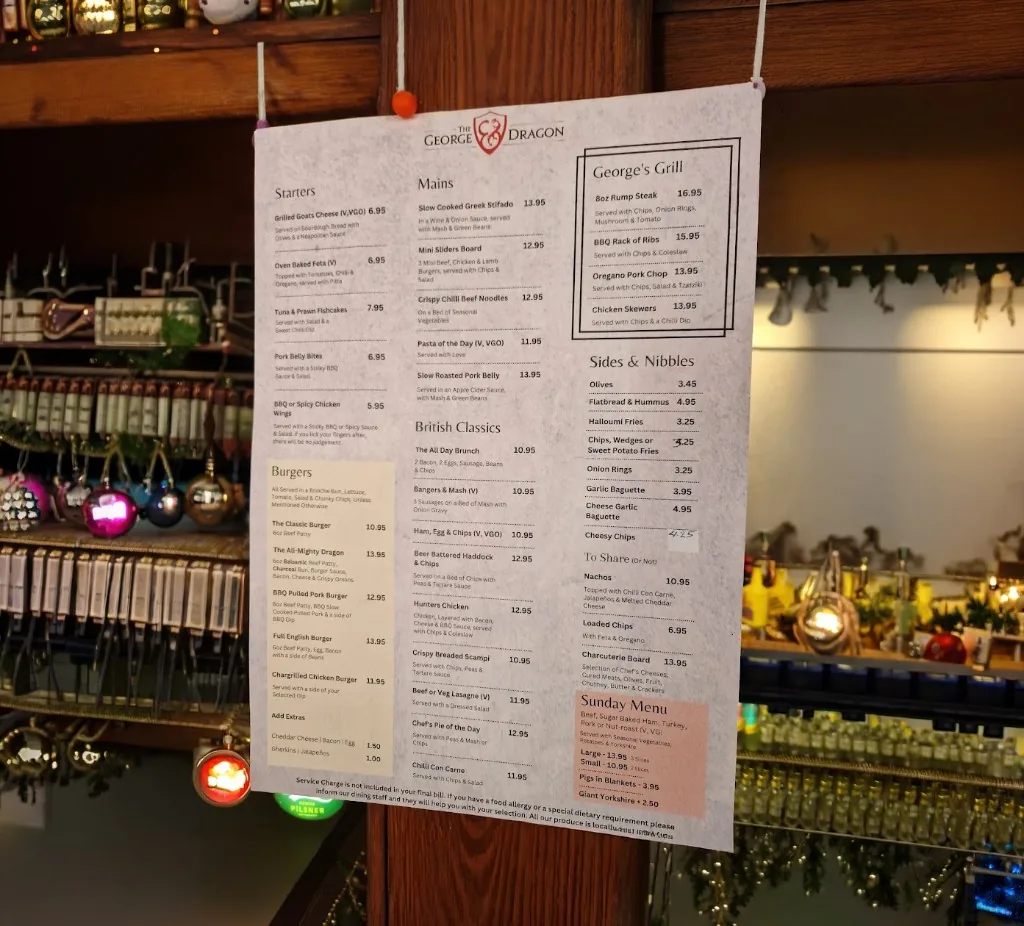
A 2008 identity redesign for The George & Dragon, a traditional pub and hotel in Long Melford, Suffolk.
The brief called for a simple dragon or shield rather than a detailed illustration. A stylized G and ampersand interlock within a central crest to form a compact dragon motif, paired with a serif wordmark that retains the character of a traditional countryside pub. The logo remains in active use across the hotel's website, social media and promotional materials.


Building something meaningful?
Currently available for select identity and digital brand projects.
Discuss a project