A wave built into the wordmark
Springwave Digital was a new digital services company.
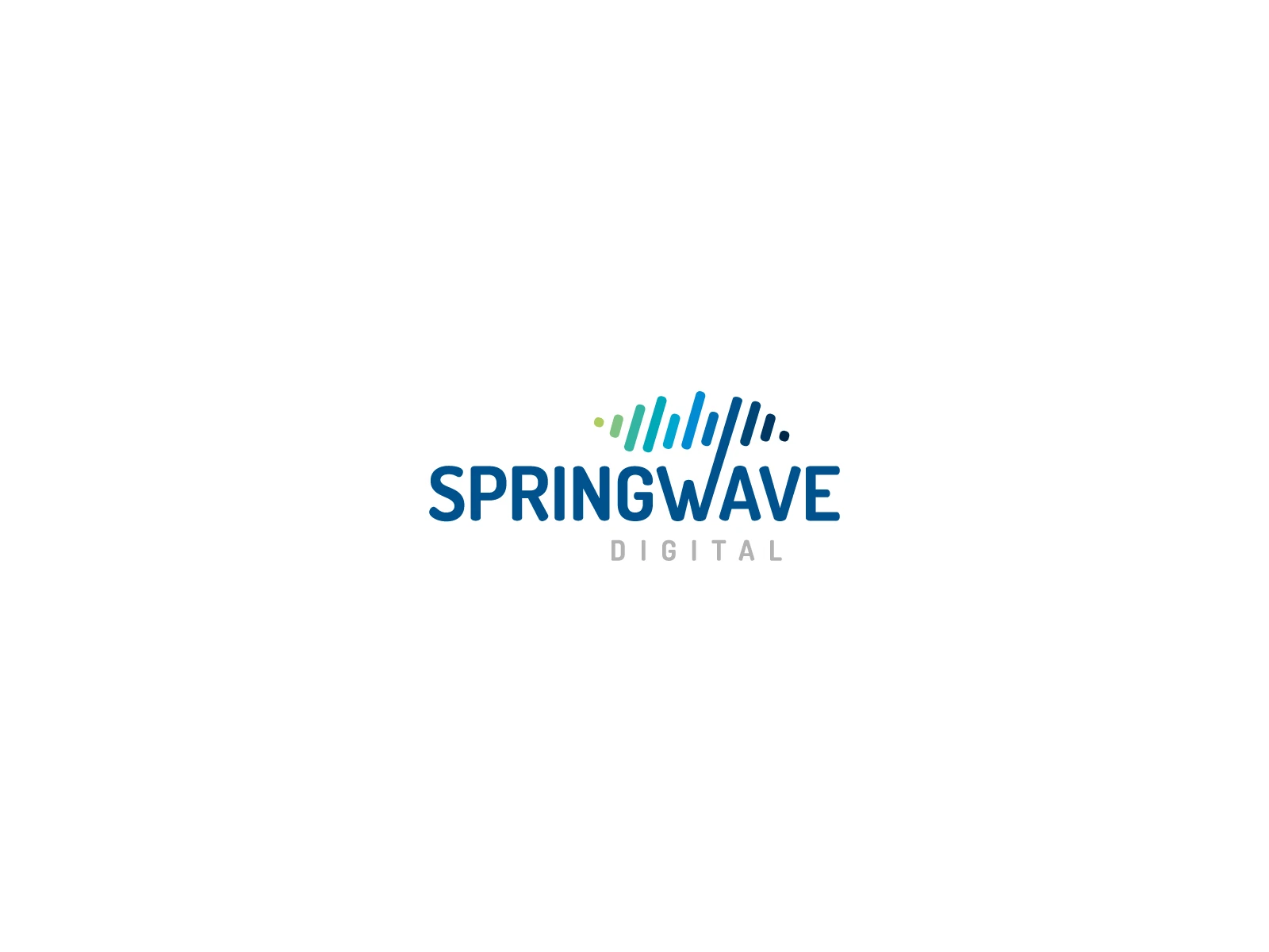
The central W extends into a sequence of rounded strokes, turning the wordmark into a wave and digital signal. A blue-to-green transition reinforces the movement, while Digital remains a quiet secondary descriptor.
Building something meaningful?
Currently available for select identity and digital brand projects.
Discuss a project