A sharper cut for Slicejack
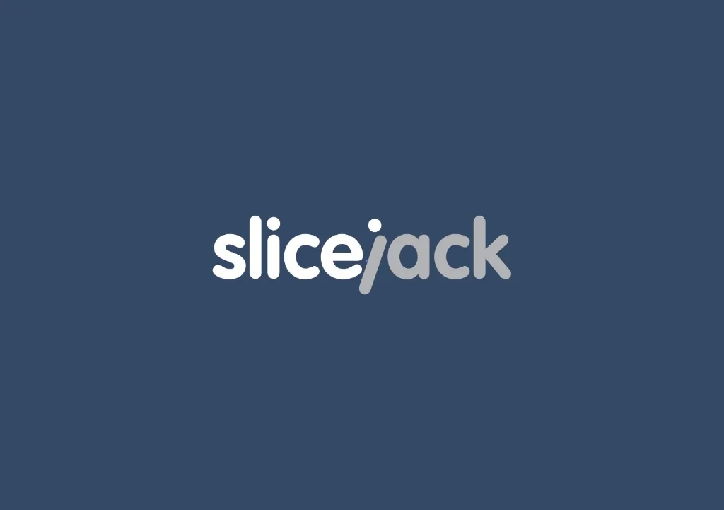
A redesigned identity for Slicejack, a front-end development studio working with design agencies.
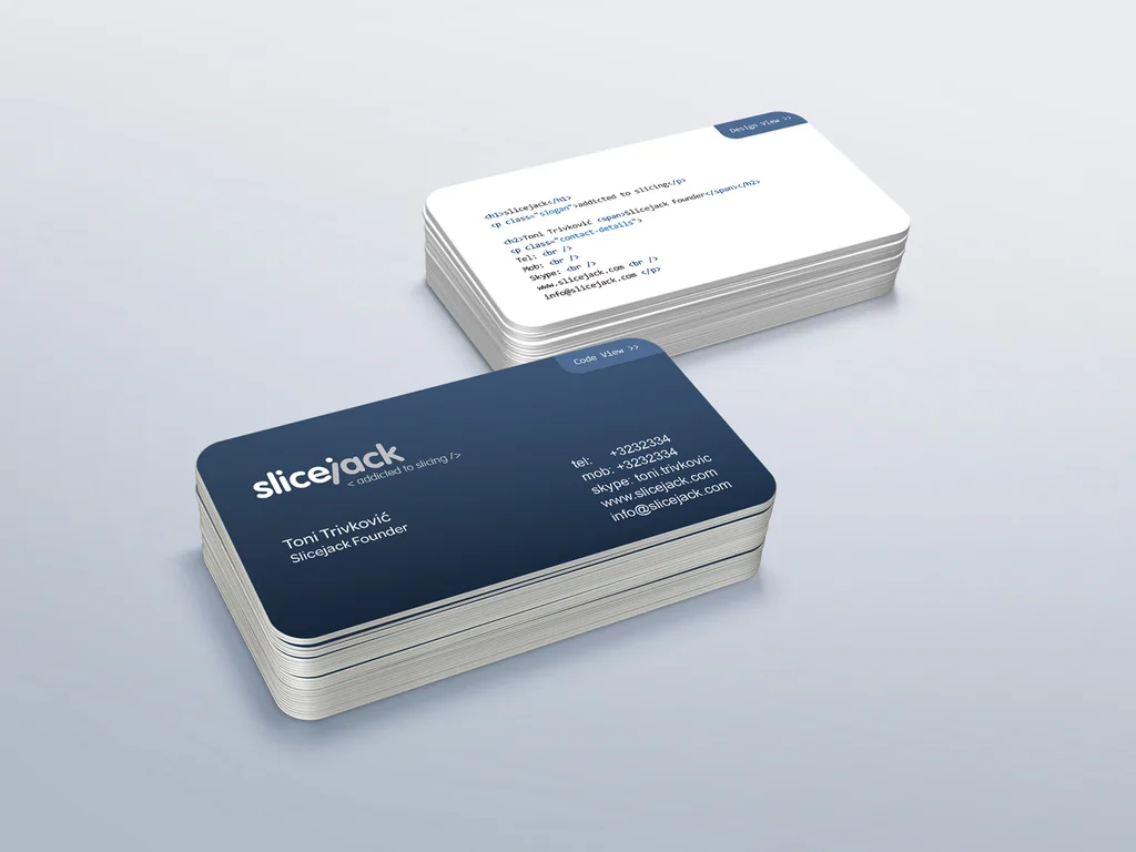
The custom wordmark distinguishes the two parts of the name while keeping them within a single compact form, giving the studio a clearer and more focused presence across digital and print applications.

From lumberjack metaphor to development-led identity
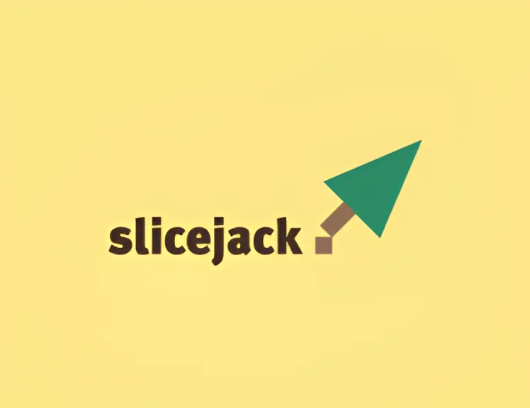
The original logo combined a cursor with a woodcut reference. The redesign moved beyond the literal metaphor, replacing it with a custom wordmark shaped around Slicejack's front-end role.
“Bojan has the power to materialise my ideas into beautiful design. He is very professional & reliable. I definitely recommend him!”
Building something meaningful?
Currently available for select identity and digital brand projects.
Discuss a project