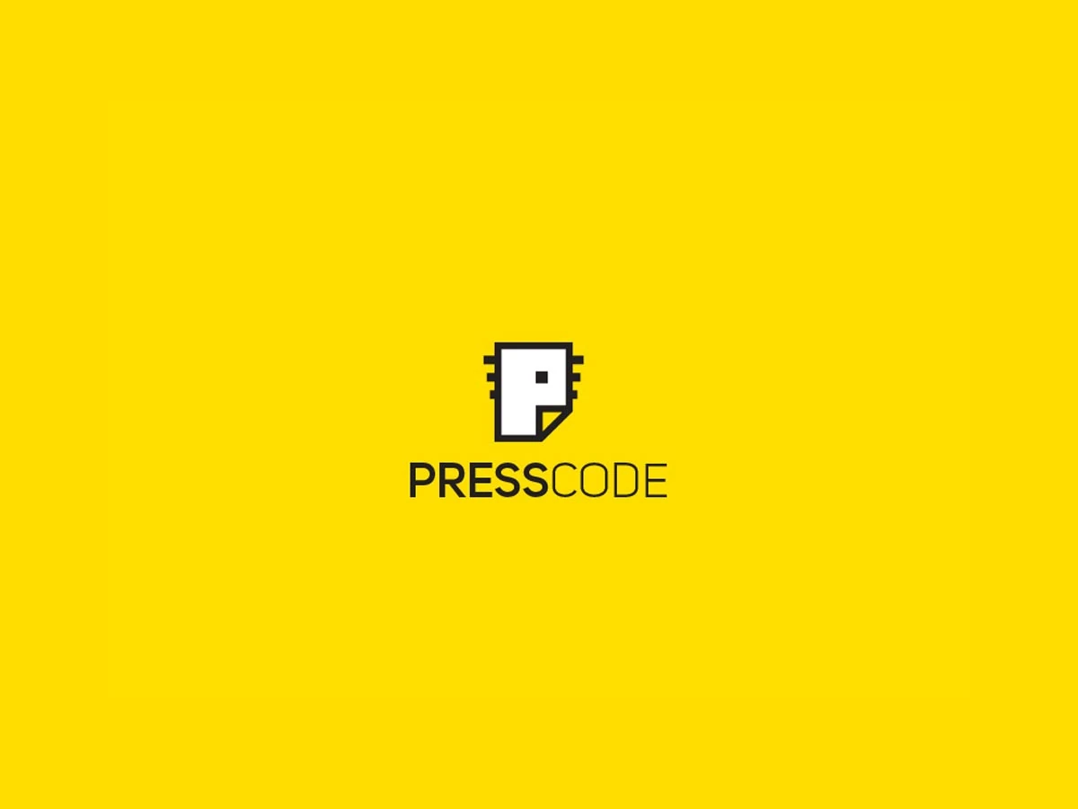
A folded P for Presscode
Proposed logo and digital direction for Presscode, a CTP and digital print house.
The mark builds a compact letter P from a folded sheet of paper, with a small square detail referencing precision and print technology. Its angular construction and orange accent extend consistently through the wordmark, print applications and website interface.

Applications
From folded mark to web screens
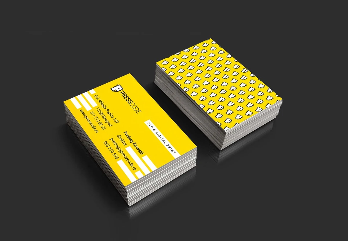
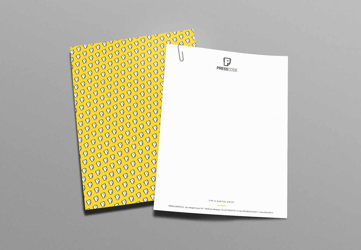
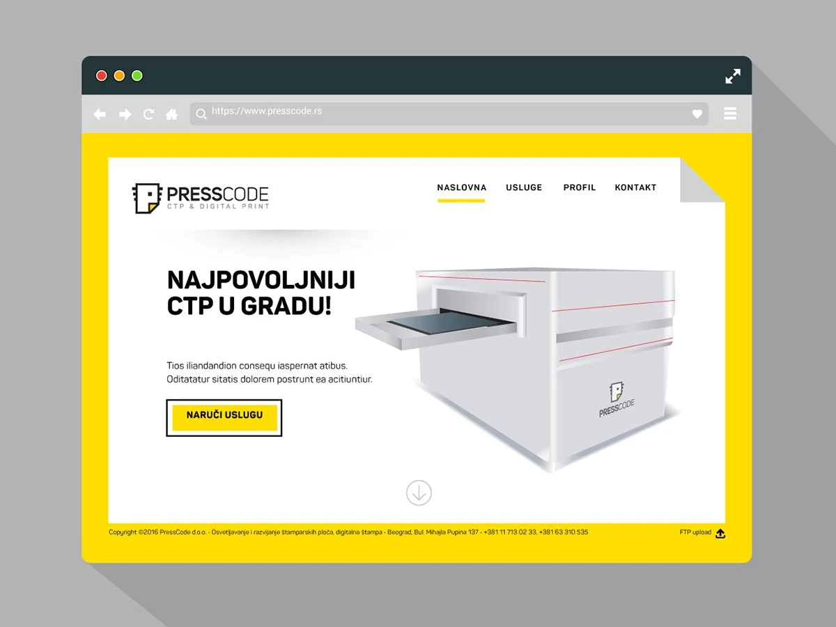
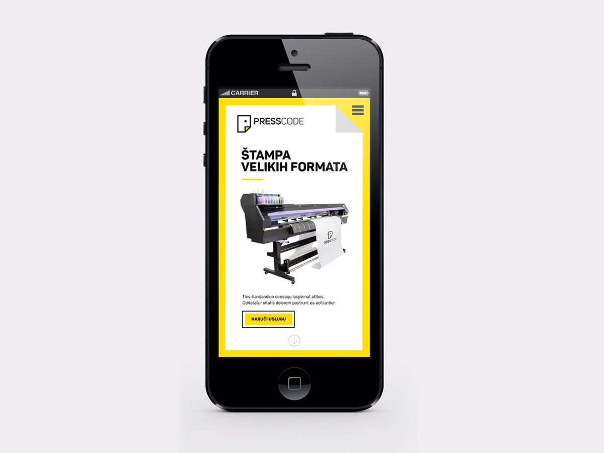
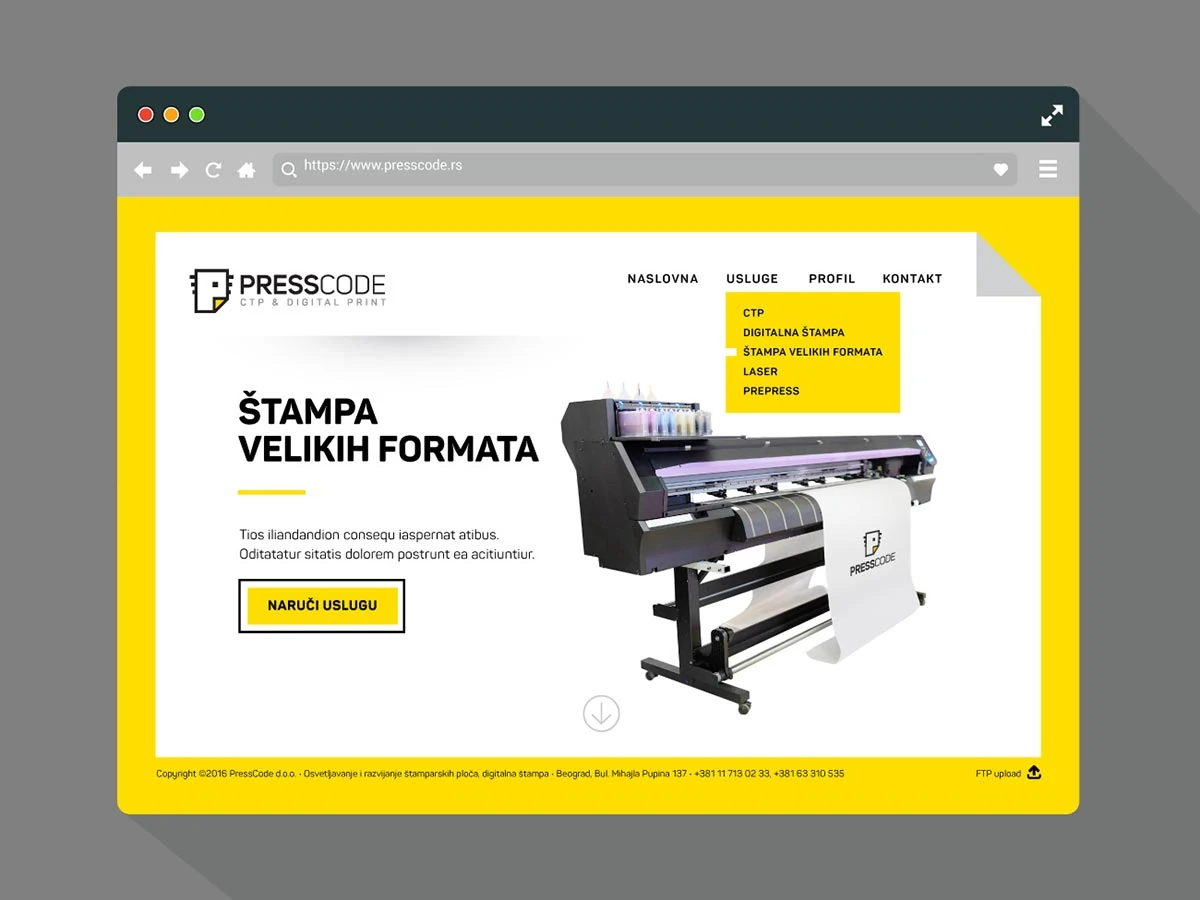
The proposed direction extended across business cards, letterhead, apparel, typography and color specifications, desktop website layouts and a mobile interface.

Building something meaningful?
Currently available for select identity and digital brand projects.
Discuss a project