A wordmark with upward momentum
Leap was a branded internal program developed through Oculus Studios for one of its clients.
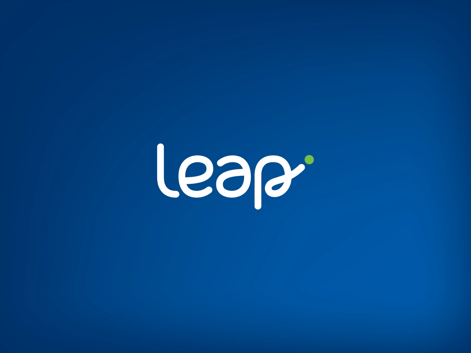
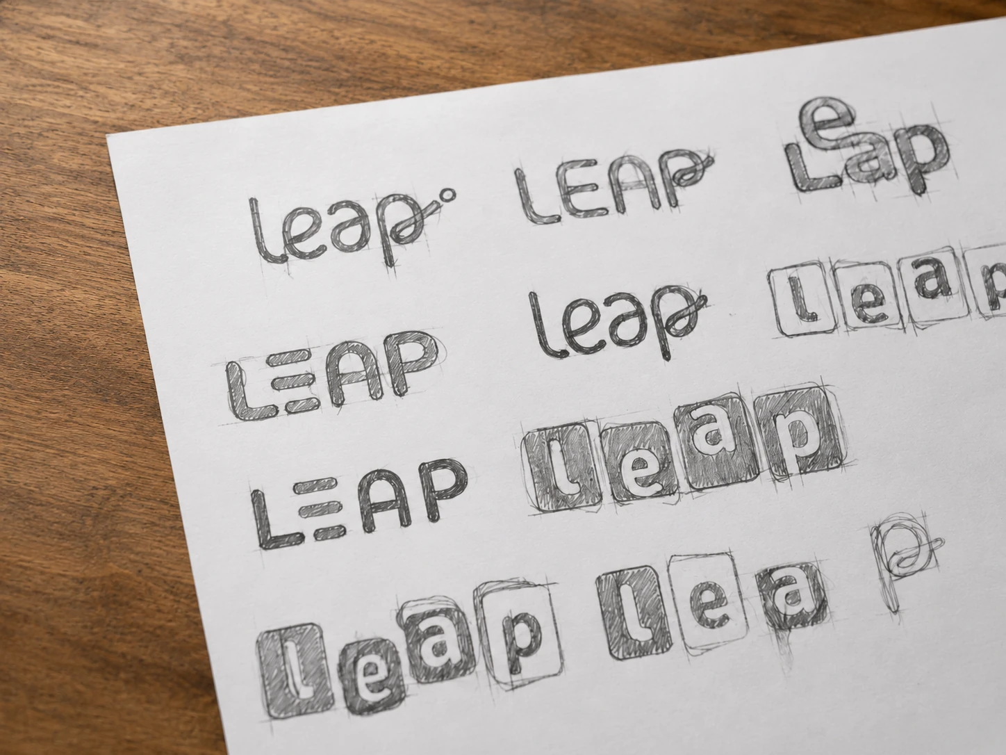
The proposed identity centers on a rounded custom wordmark, with the final letter rising into a small green accent. The gesture gives the name a sense of movement and progress while keeping the mark simple and approachable.
Building something meaningful?
Currently available for select identity and digital brand projects.
Discuss a project