A fork wired for online ordering
Naming and identity for Forkwire, an early online food delivery service.
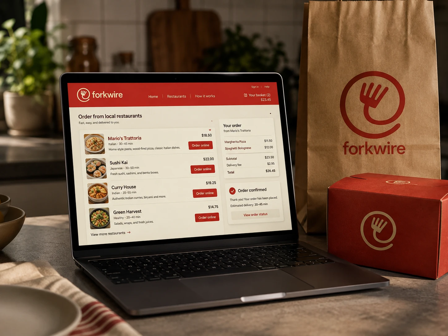
Created when ordering food online was still relatively new, the symbol combines a fork with the @ sign, while the name connects food with the digital network behind the service. The compact mark was designed to work across the website, ordering interface and packaging.



Building something meaningful?
Currently available for select identity and digital brand projects.
Discuss a project