A clear alternative
Naming and identity for an established online retail operation moving into a new chapter as Alteo.
From Bisshop to Alteo
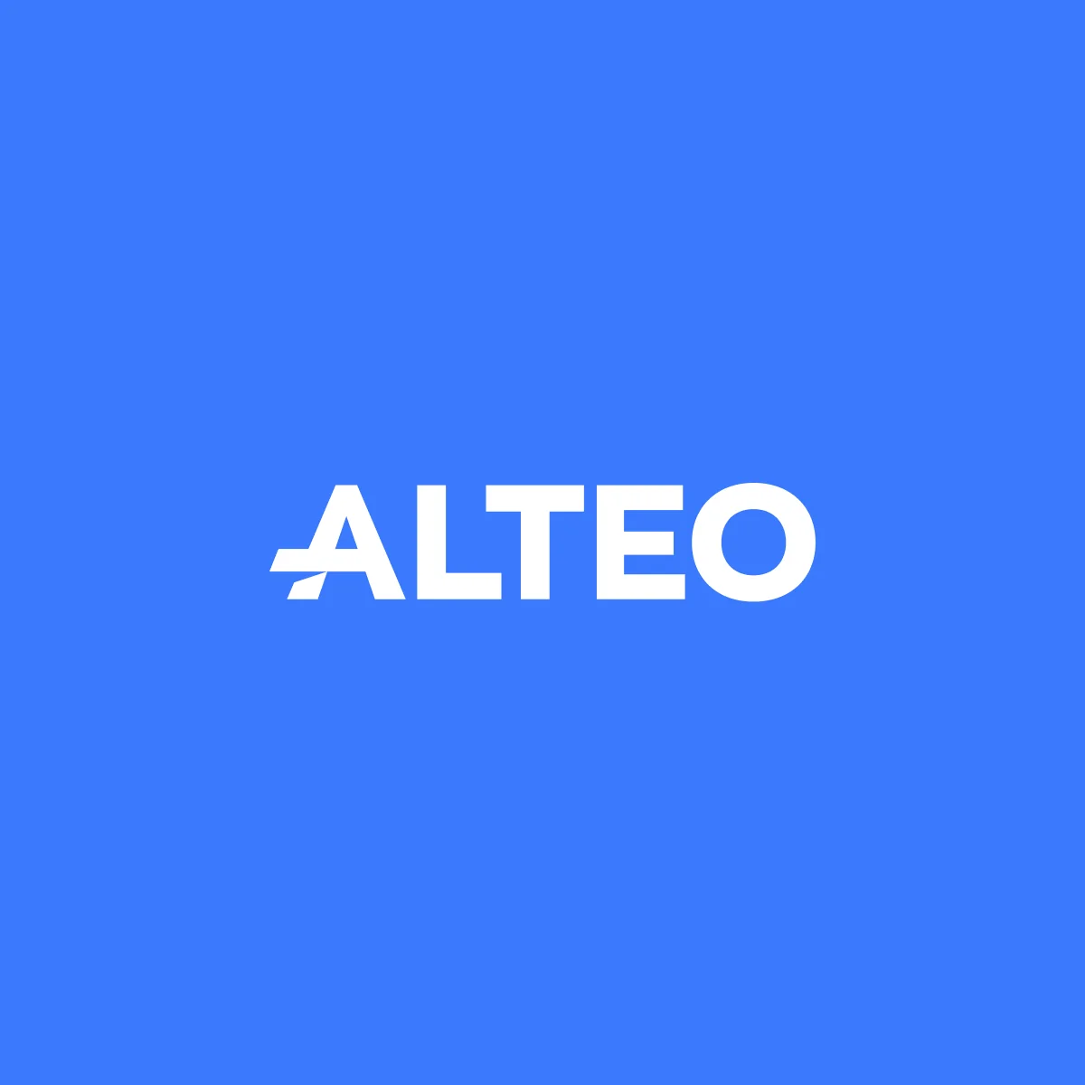
The business already had an active online shop, but its name and identity belonged to the previous chapter. Alteo brought together the two qualities the brief kept returning to: an alternative, and clarity.
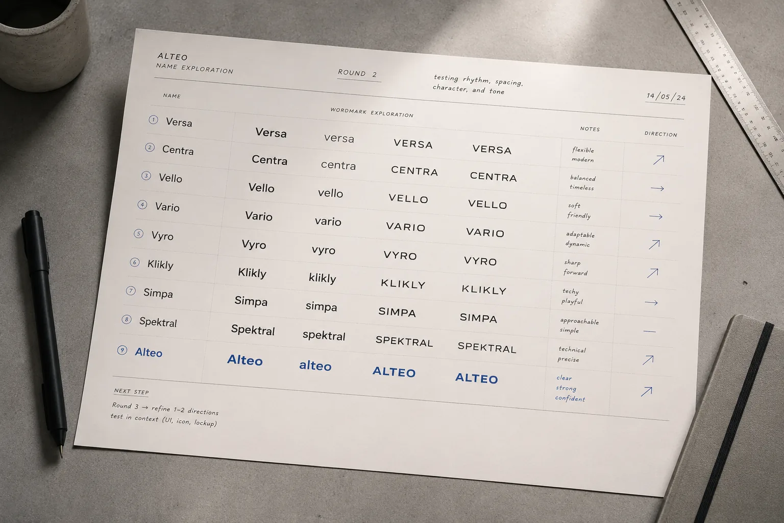
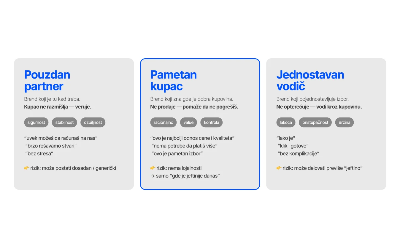
Alteo naming territories
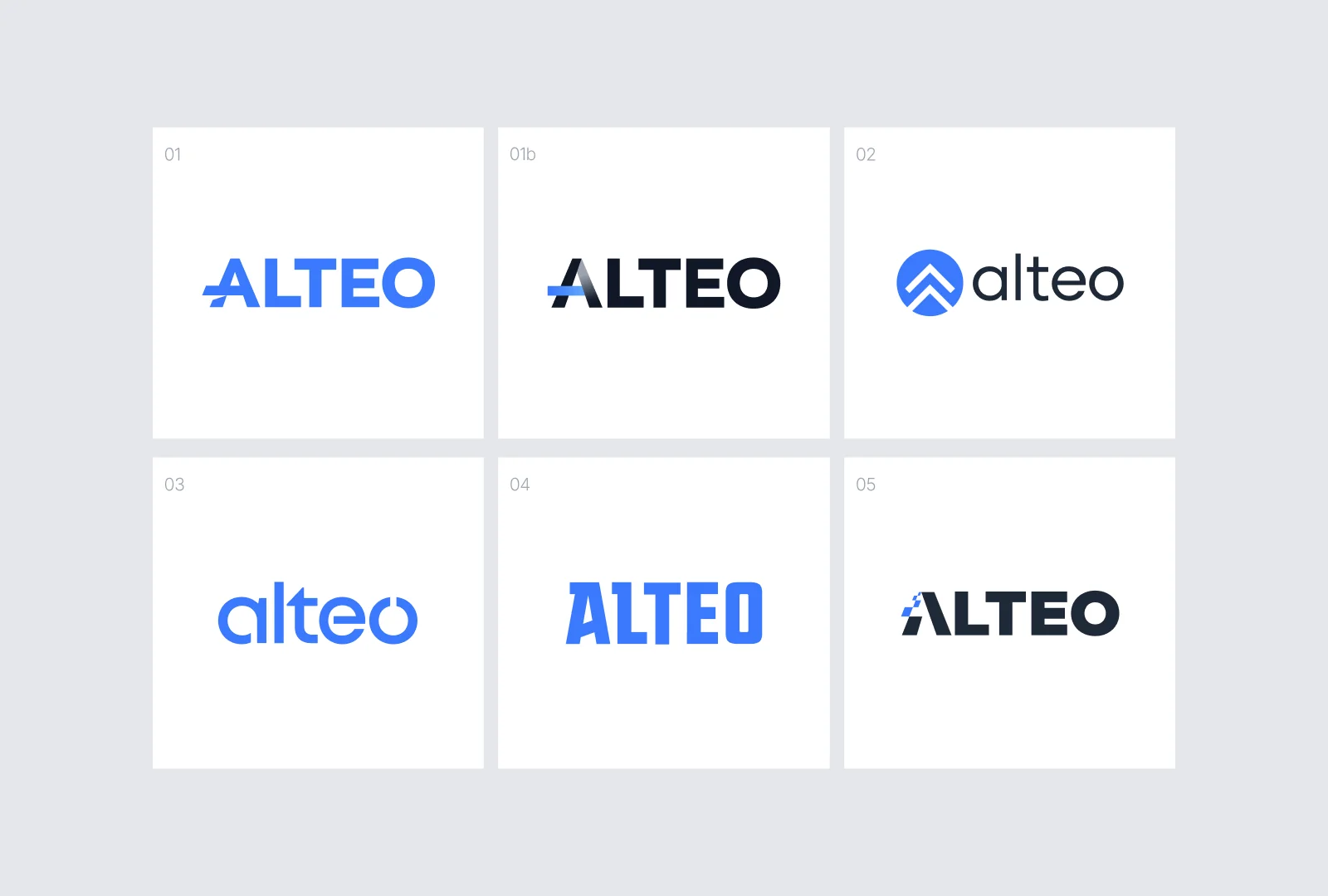
Six routes, one that held together
The identity study moved from restrained wordmarks to more expressive symbol-led routes. The selected direction found the right balance: distinctive enough to remember, simple enough to use across the retail experience.
A system made for digital retail
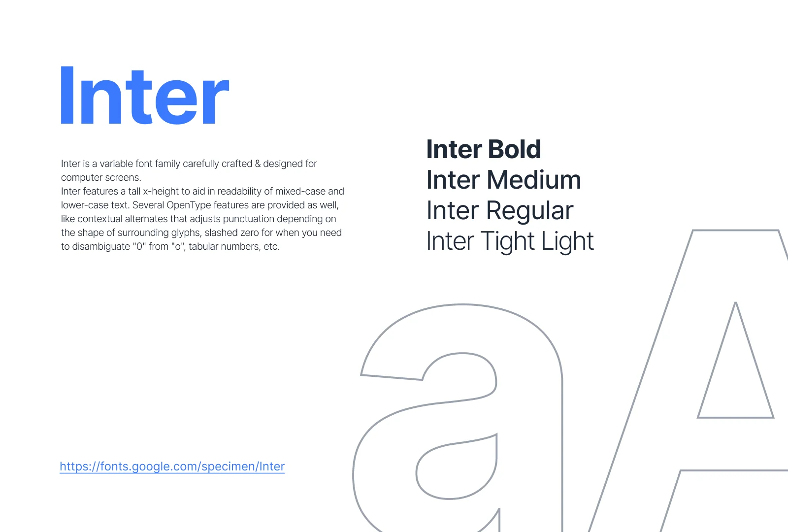
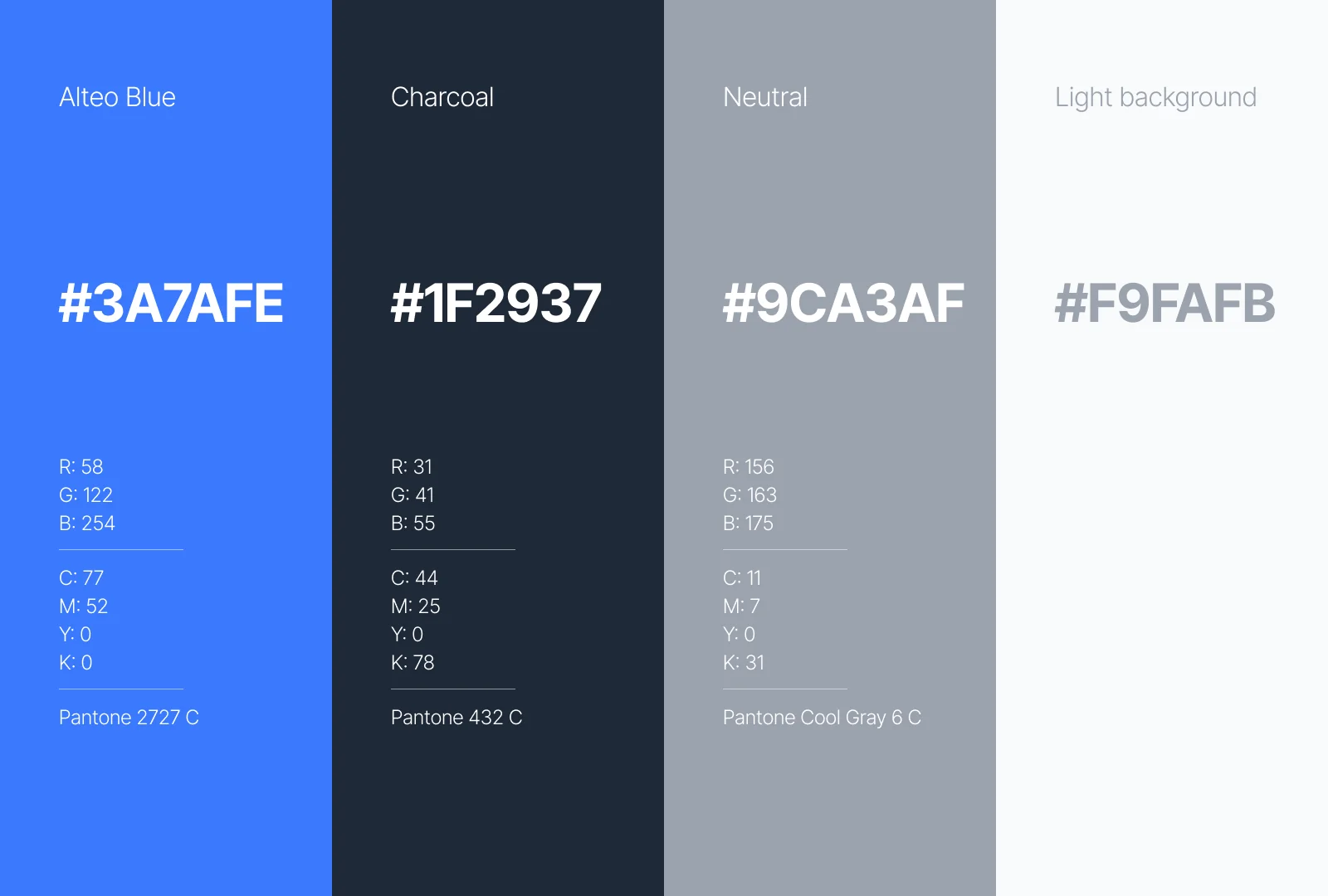
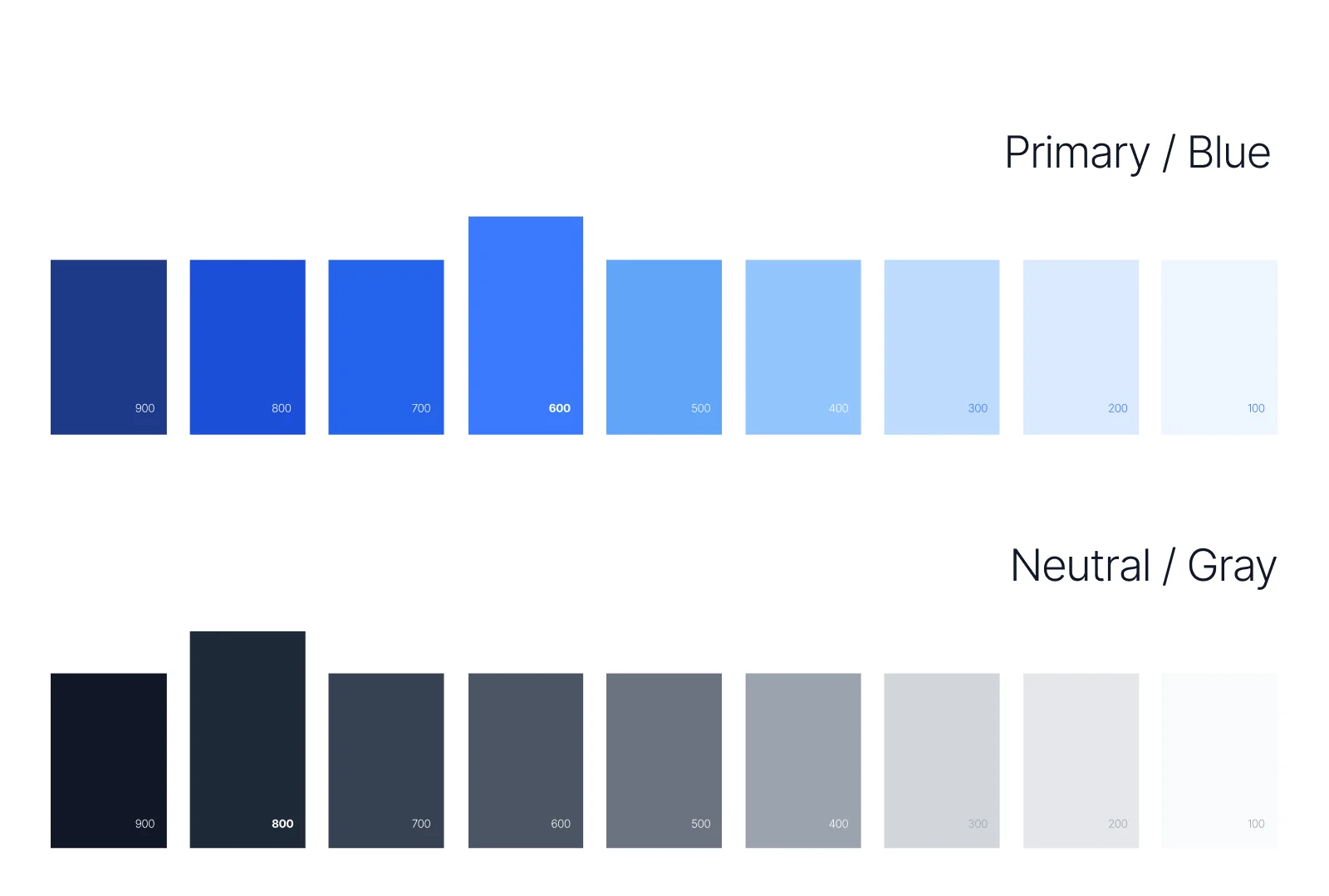
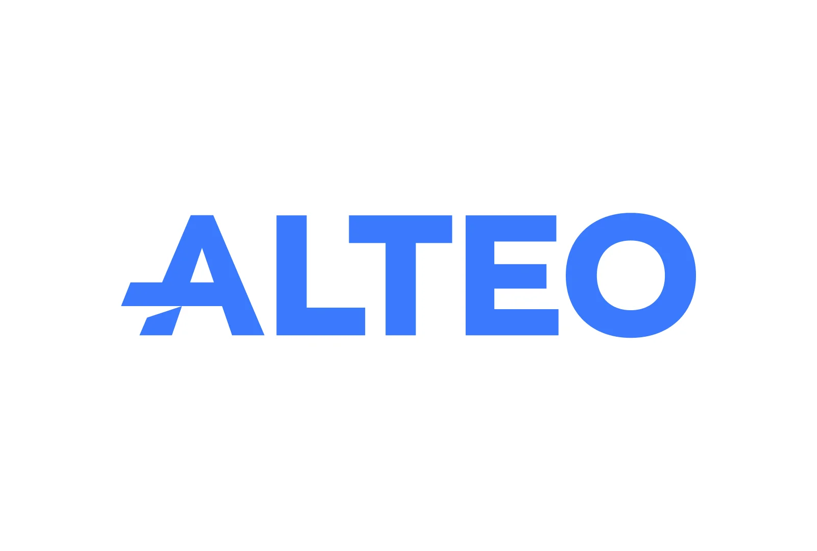
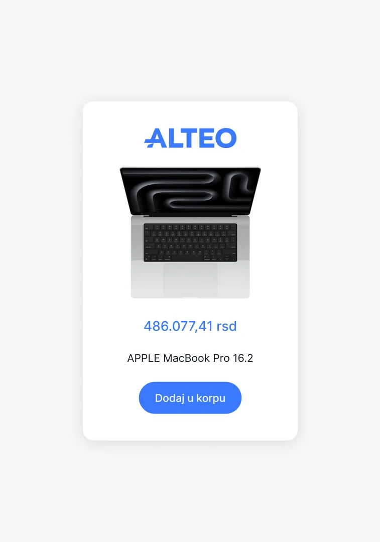
The final identity centers on a custom wordmark and an A that can also work on its own as an avatar. Inter, a focused blue palette and a practical interface color set give the brand enough range for everyday retail use without making the system feel busy.

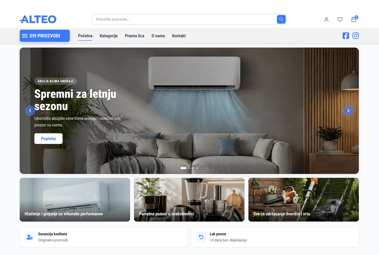
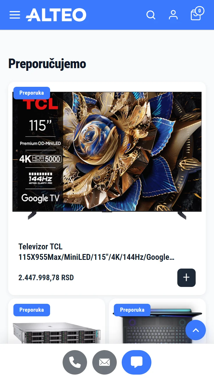
From the Brand Book to the live store
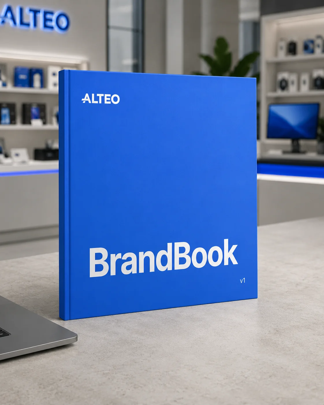
The Brand Book covered logo use, typography, color, interface states and common applications. It gave the development team a clear reference as the new Alteo store moved from concept to launch.

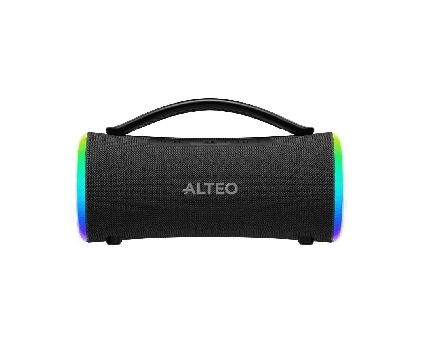

A brand of its own
Alteo gave an existing retail operation a name, identity and practical system of its own. What was already working as a business could now move forward as a recognizable brand.
Have a project in mind?
Let's discuss what the brand needs now, and what it should be able to become.
Discuss a project