A mark built for every surface
Identity proposal for ALCO Electronics, built around a custom geometric wordmark designed to hold across products, screens, motion and packaging.
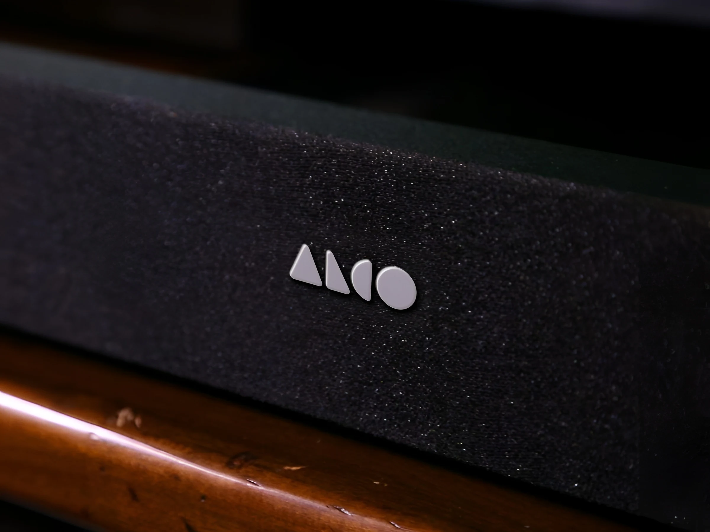
A wordmark built from one geometry
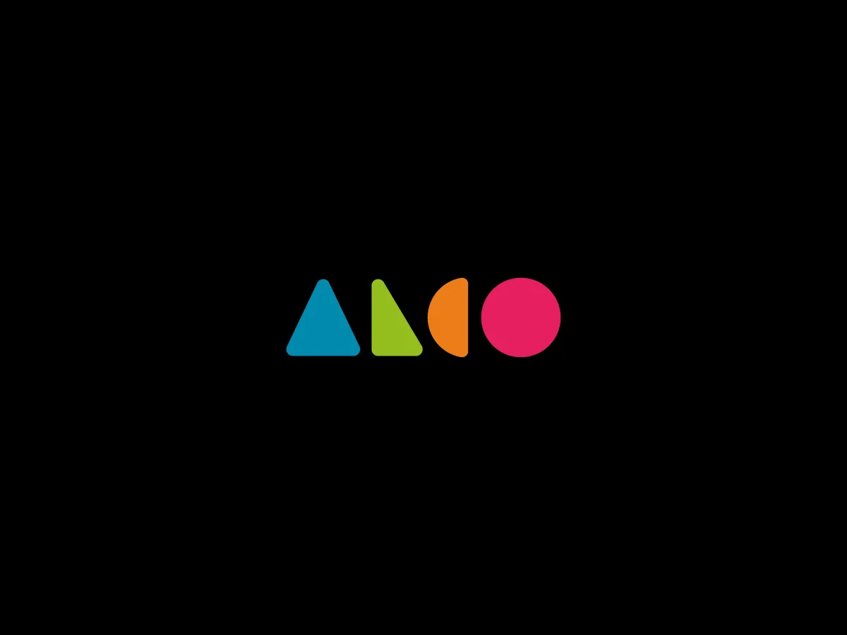
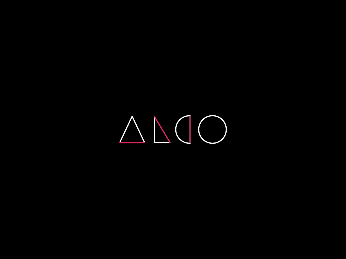
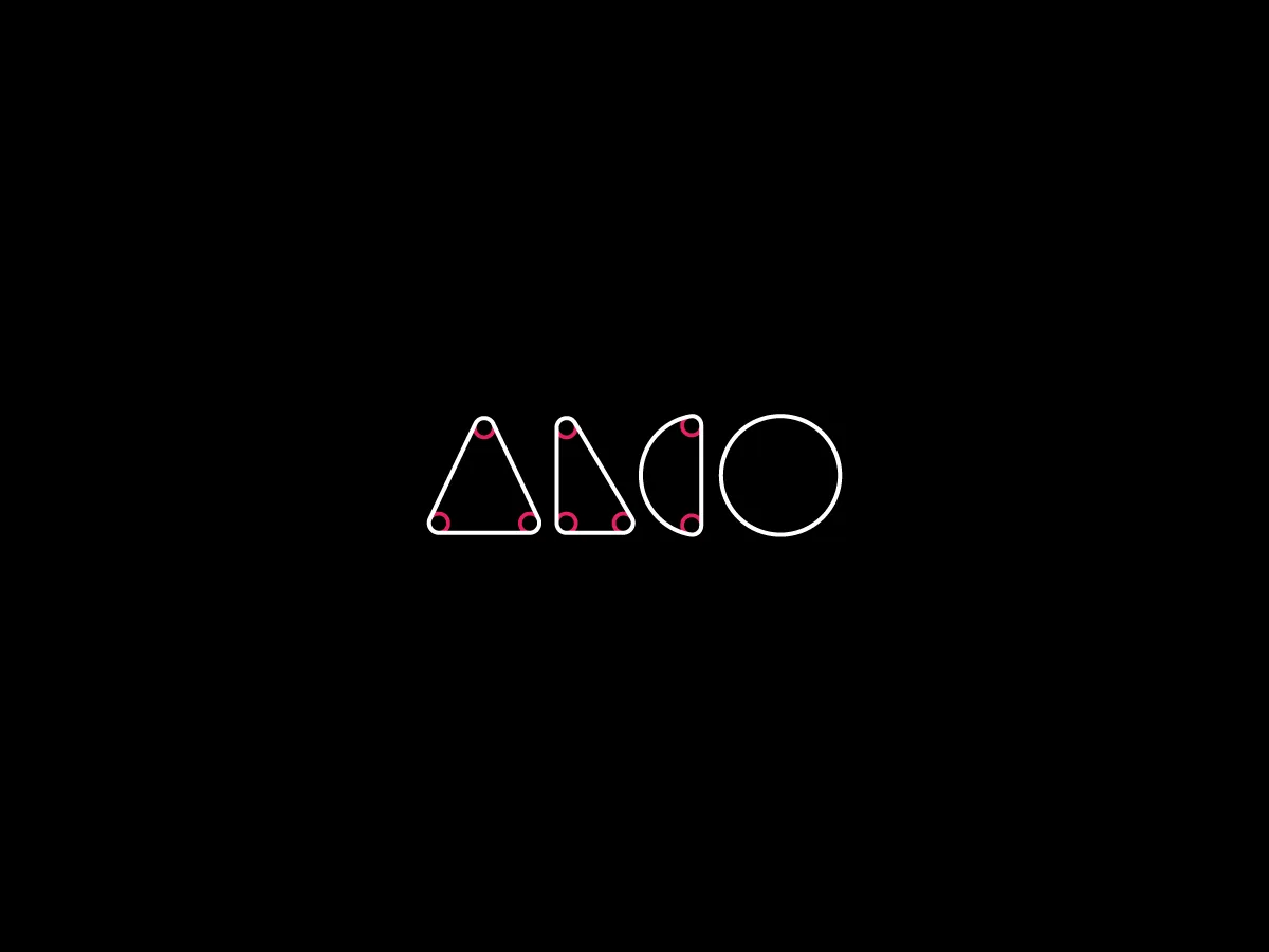
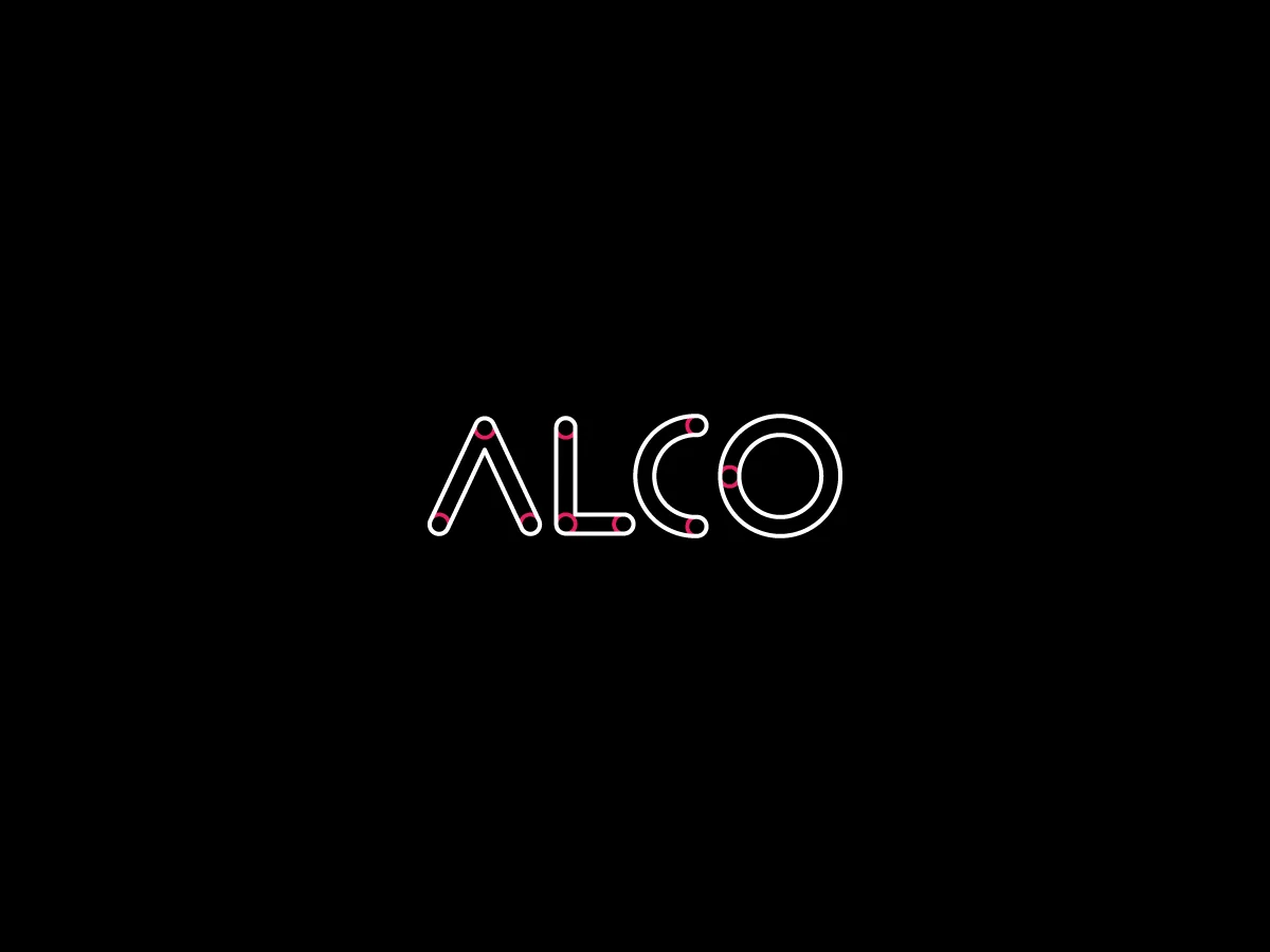
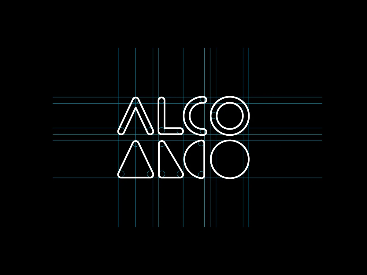
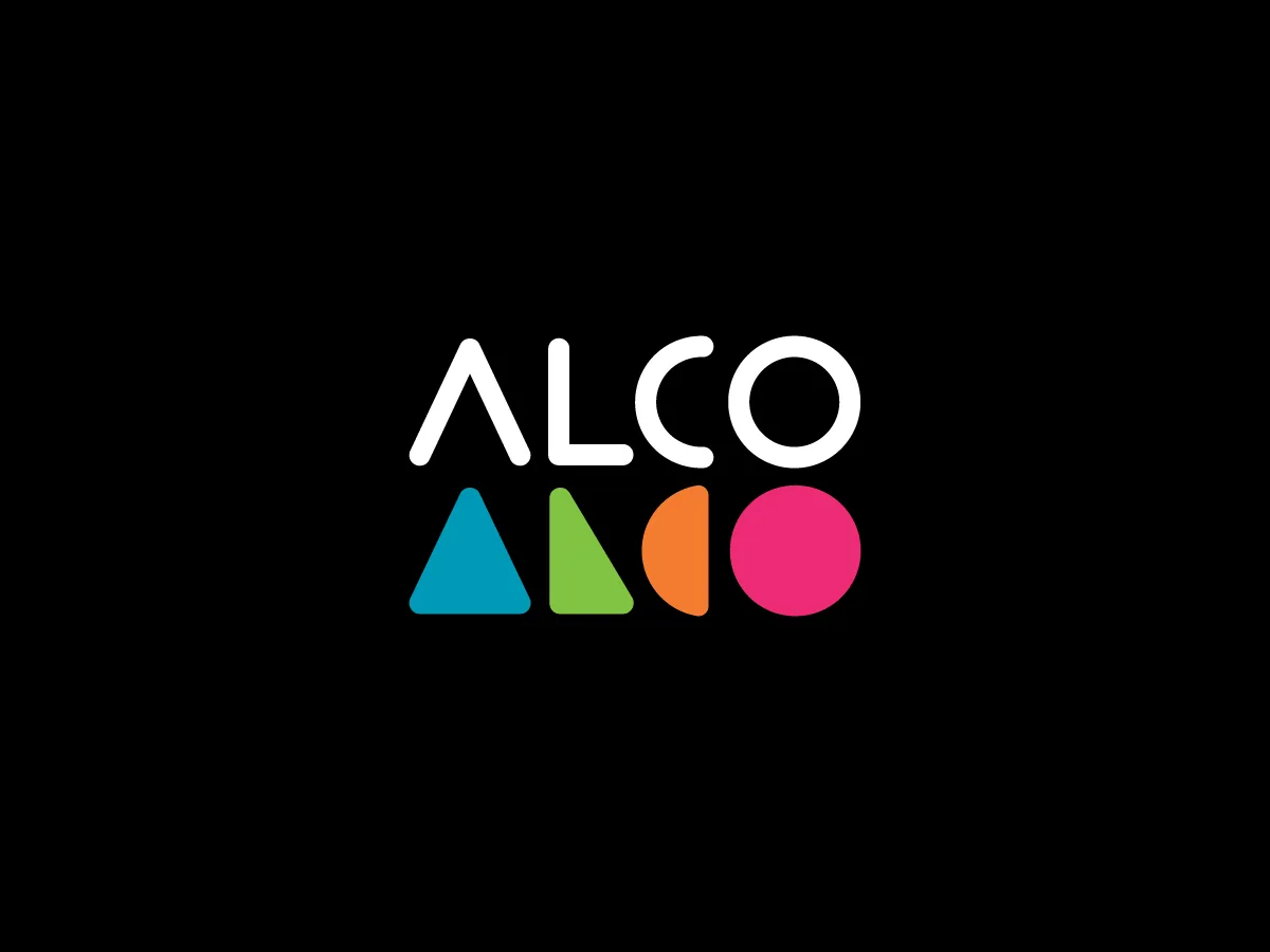
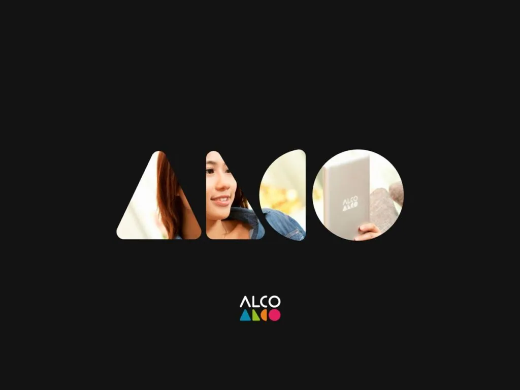
The brief called for a mark that could survive engraving, icon scale and motion without losing its character. With only four letters to work with, the wordmark was drawn from scratch, using the same geometric logic across every character. Construction studies documented the proportions and relationships behind it.
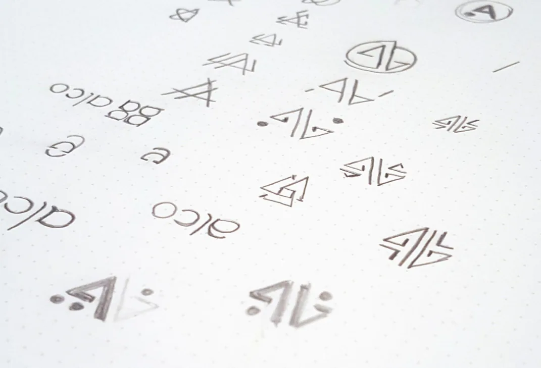
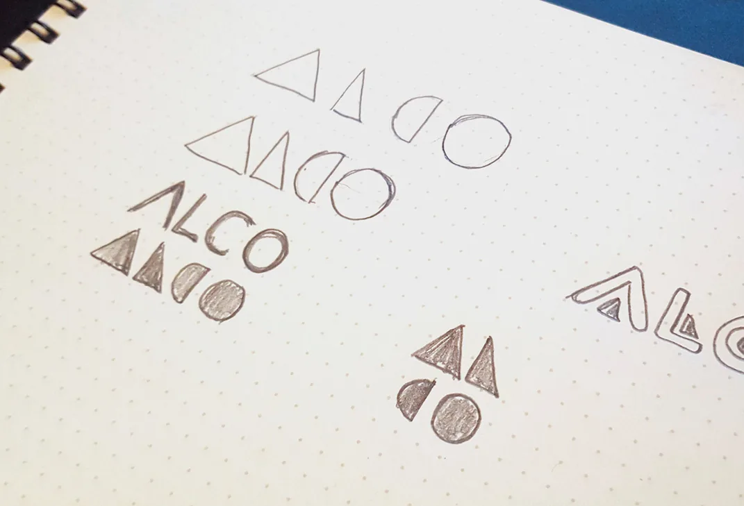


The geometry became the system
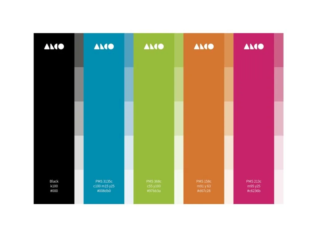
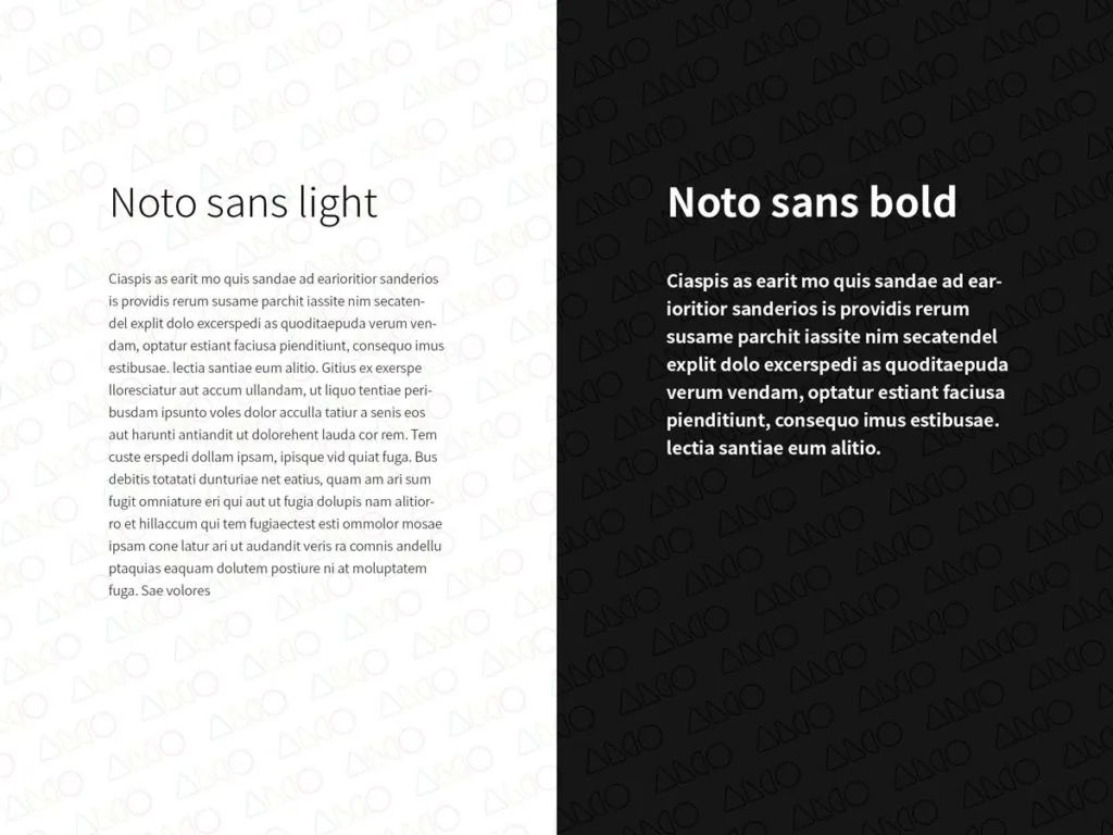
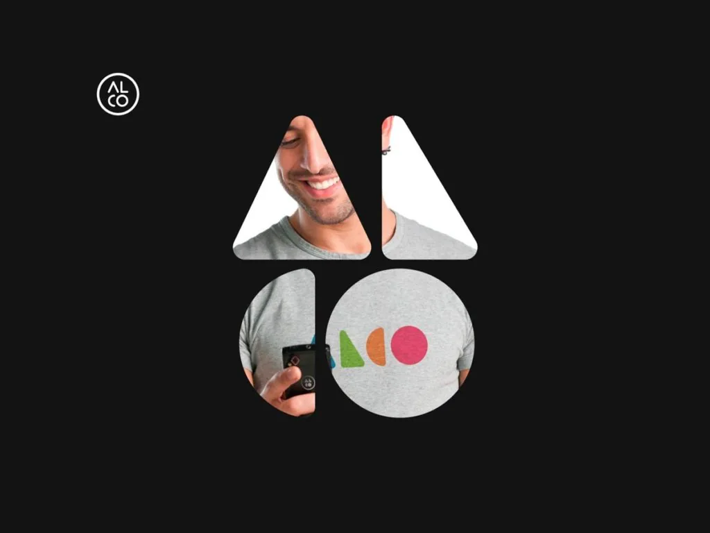
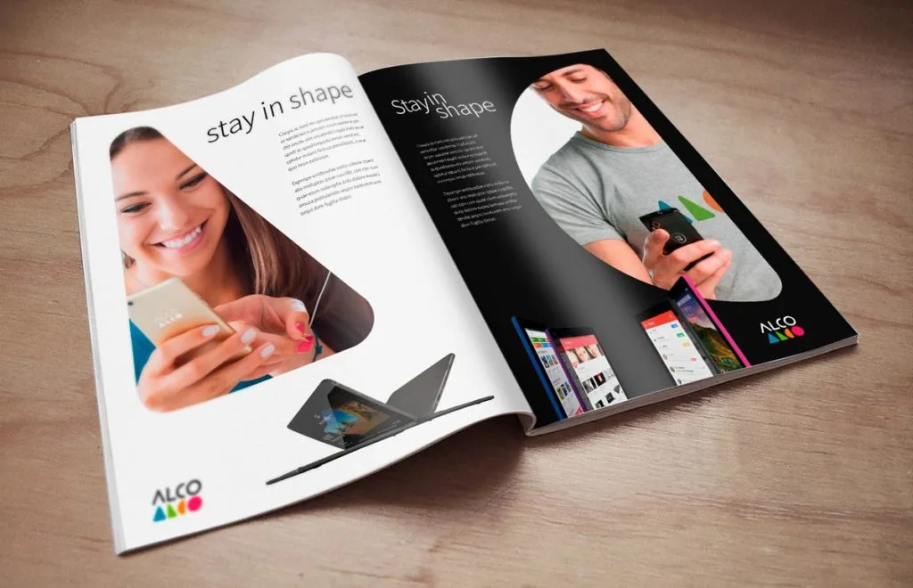
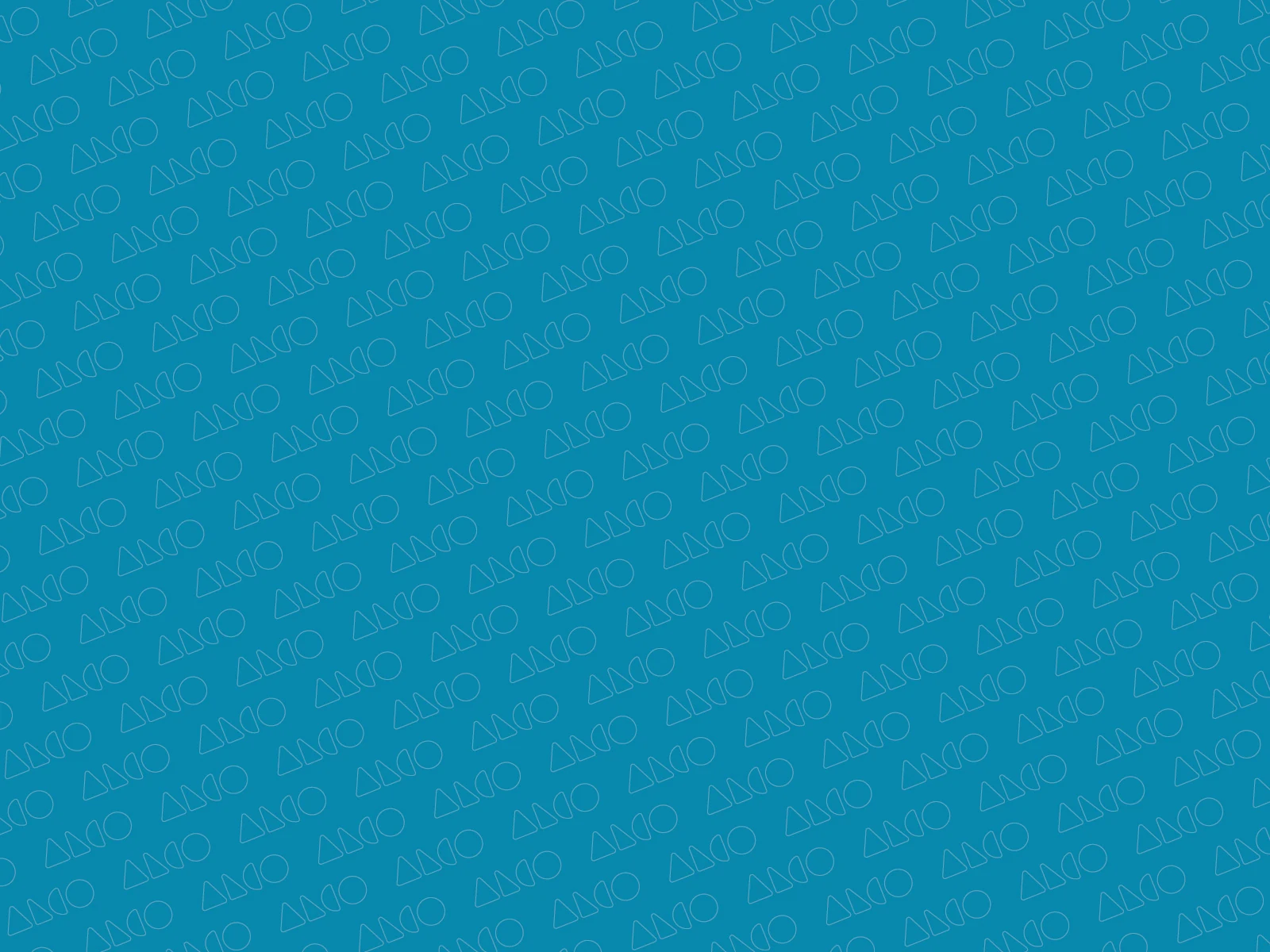
The same shapes moved beyond the wordmark into pattern, image framing and layout. A restrained palette and Noto Sans gave the identity a practical visual language for product communication, while the underlying geometry kept each application recognizably ALCO.
From product to packaging
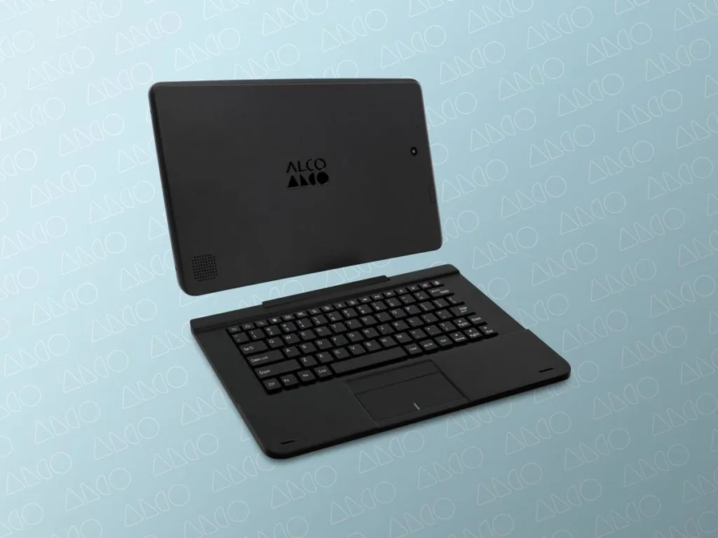
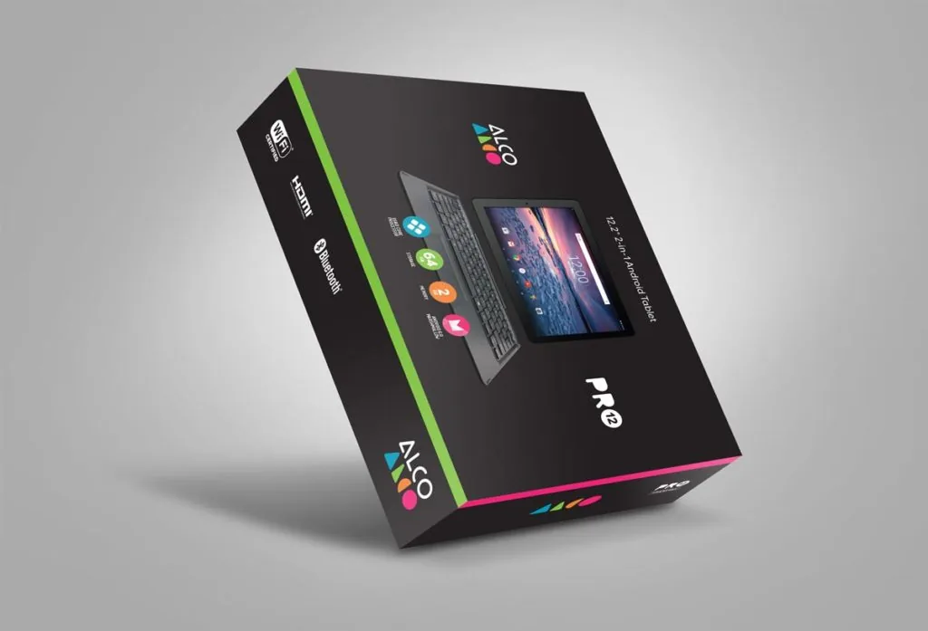
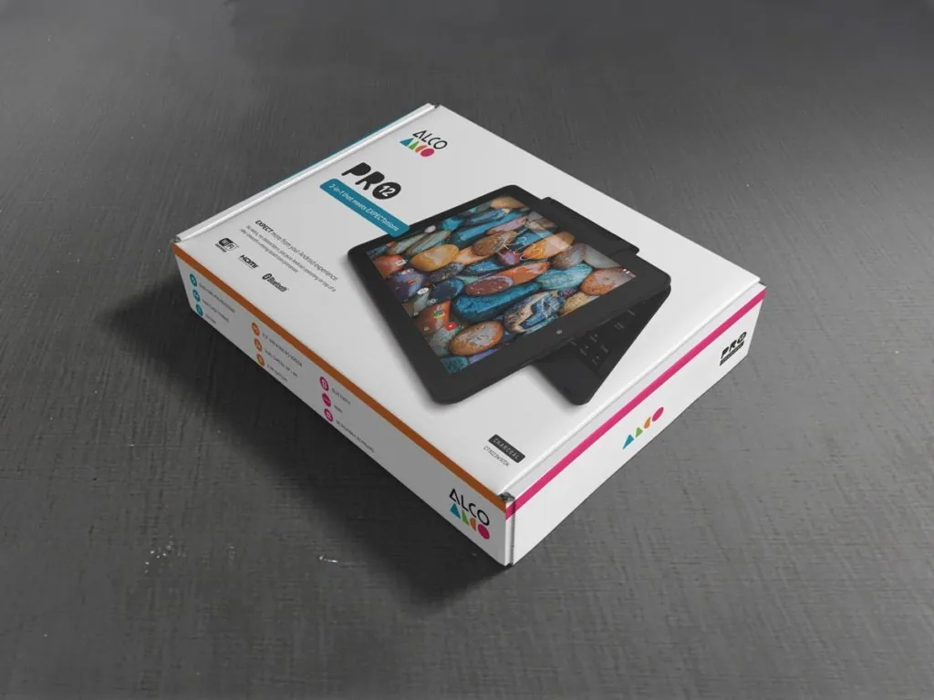
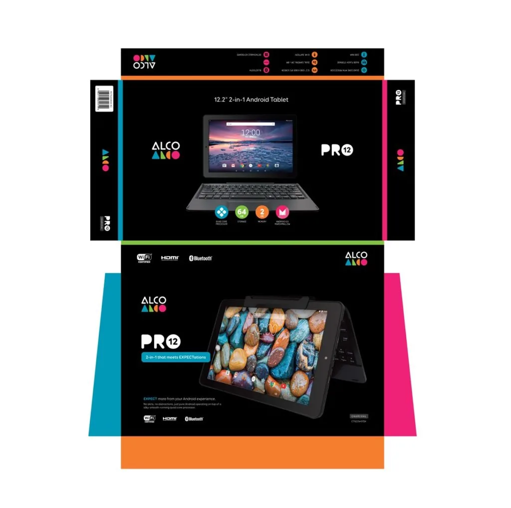
From product hardware and communication layouts to Pro 12 retail packaging, the system was tested where the product line would actually ship.


A system taken beyond the logo
The proposal developed the ALCO mark into a broader identity system across motion, product applications and retail packaging. Although the direction was not ultimately adopted, it was carried through a full application and guidelines stage.

Have a project in mind?
Let's discuss what the brand needs now, and what it should be able to become.
Discuss a project