Soniq project
Blockchain solutions for
music lovers
Brand identityBrand manualBusiness cardsLogo systemPrint productionT-shirt
Objectives
The Soniq project crew commissioned studio Logoholik to create a unique logo system and brand guidelines for their upcoming attempt at world domination 🙂 and disruption in the music industry. Their goal wasn’t to merely create just a symbol. They wanted something more fluid.
Hello!
I am Soniq logo!
Our Logo is the critical building block of our identity, the primary visual element that identifies us. The signature is a combination of the S – waves monogram enclosed in universal music/play symbol and our full company name – they have a fixed relationship that should never be changed in any way.
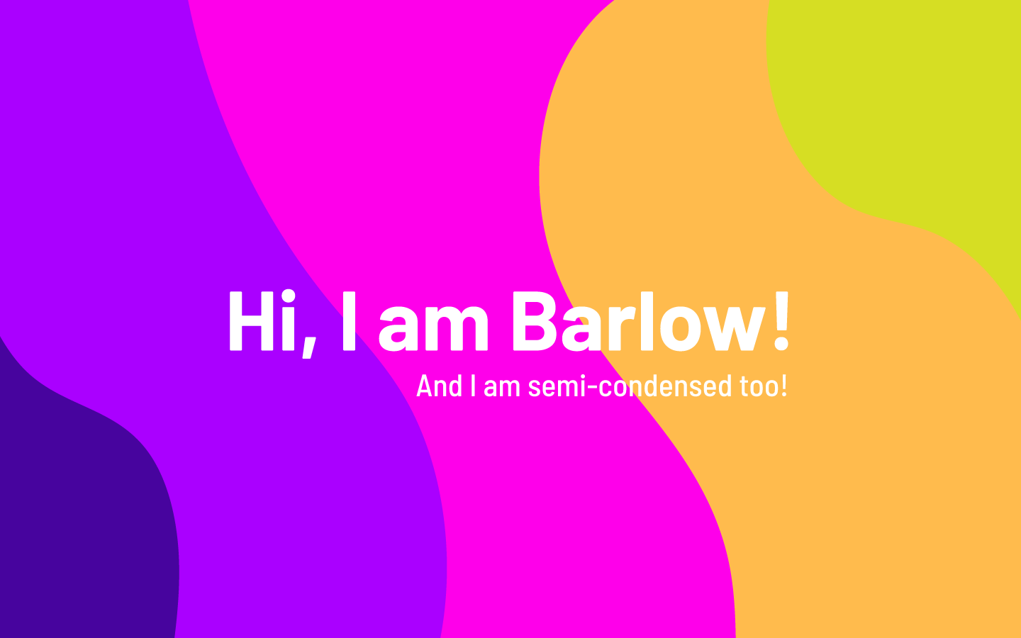
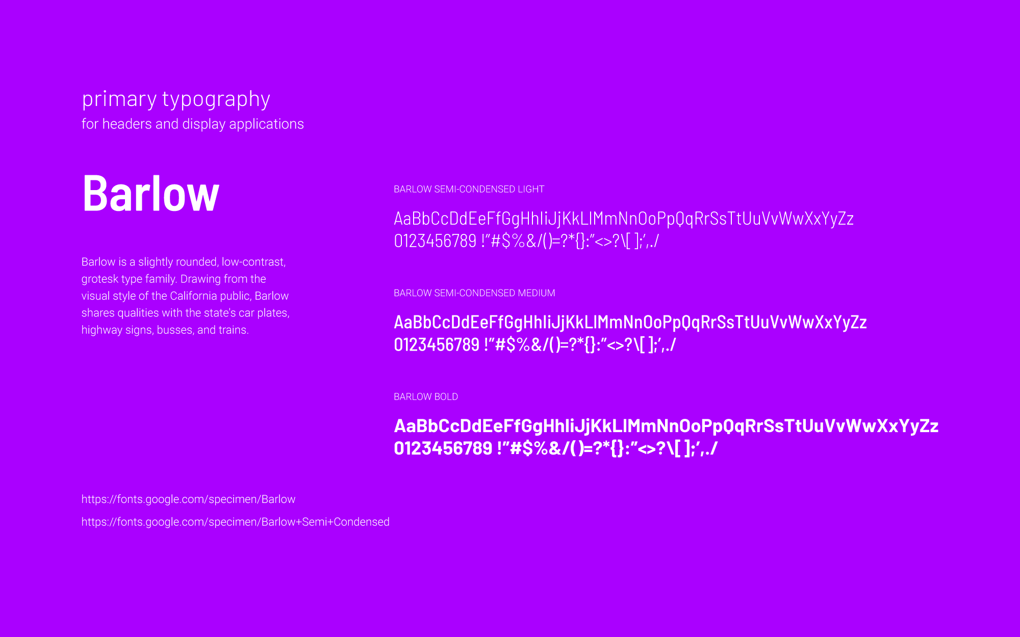
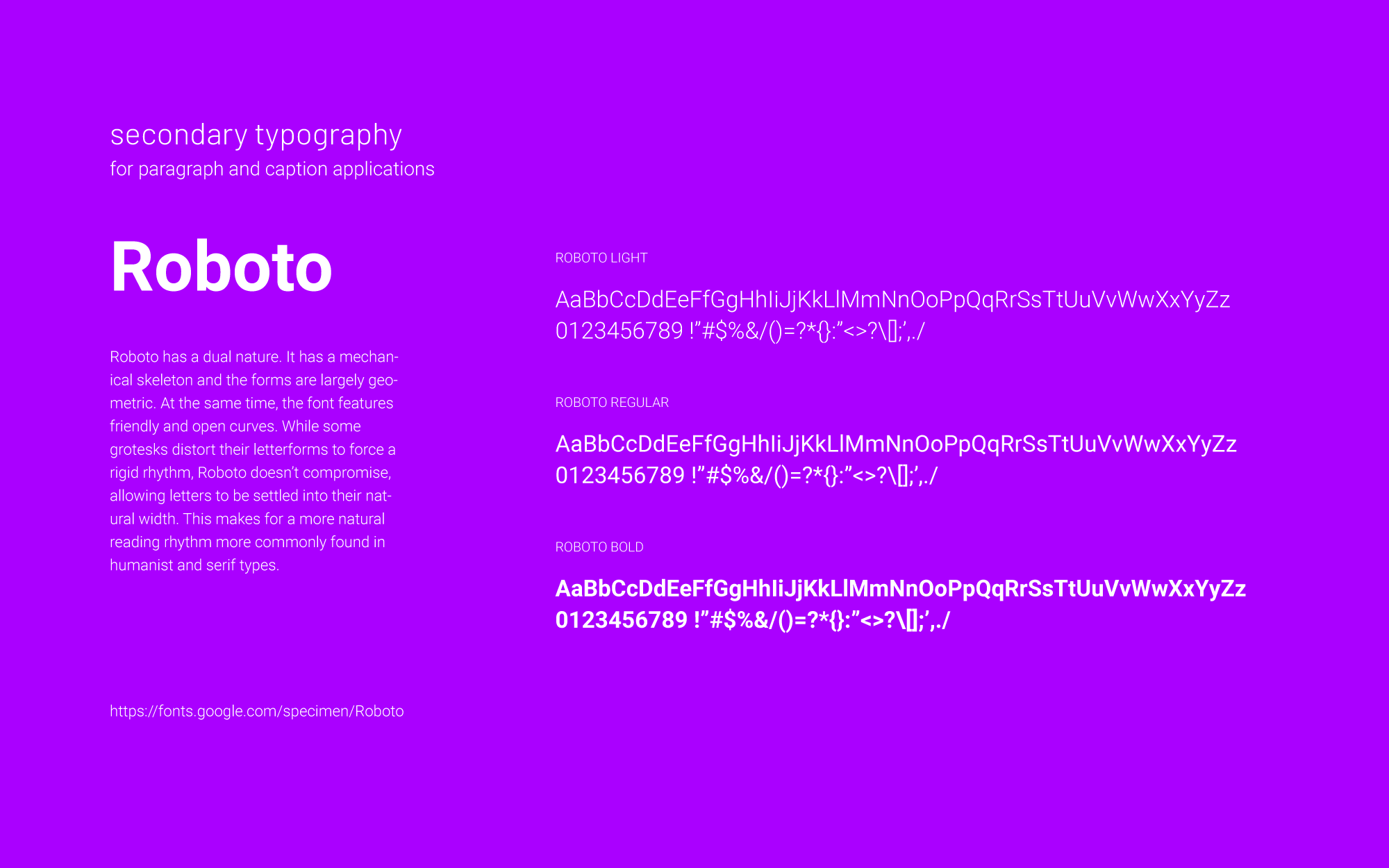
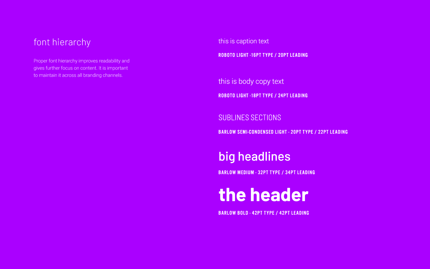
Typography
A well-proportioned, clean font can make all the difference on a website or even a corporate flyer. Good typography creates that “There’s something about that” feeling in people’s consciousness.
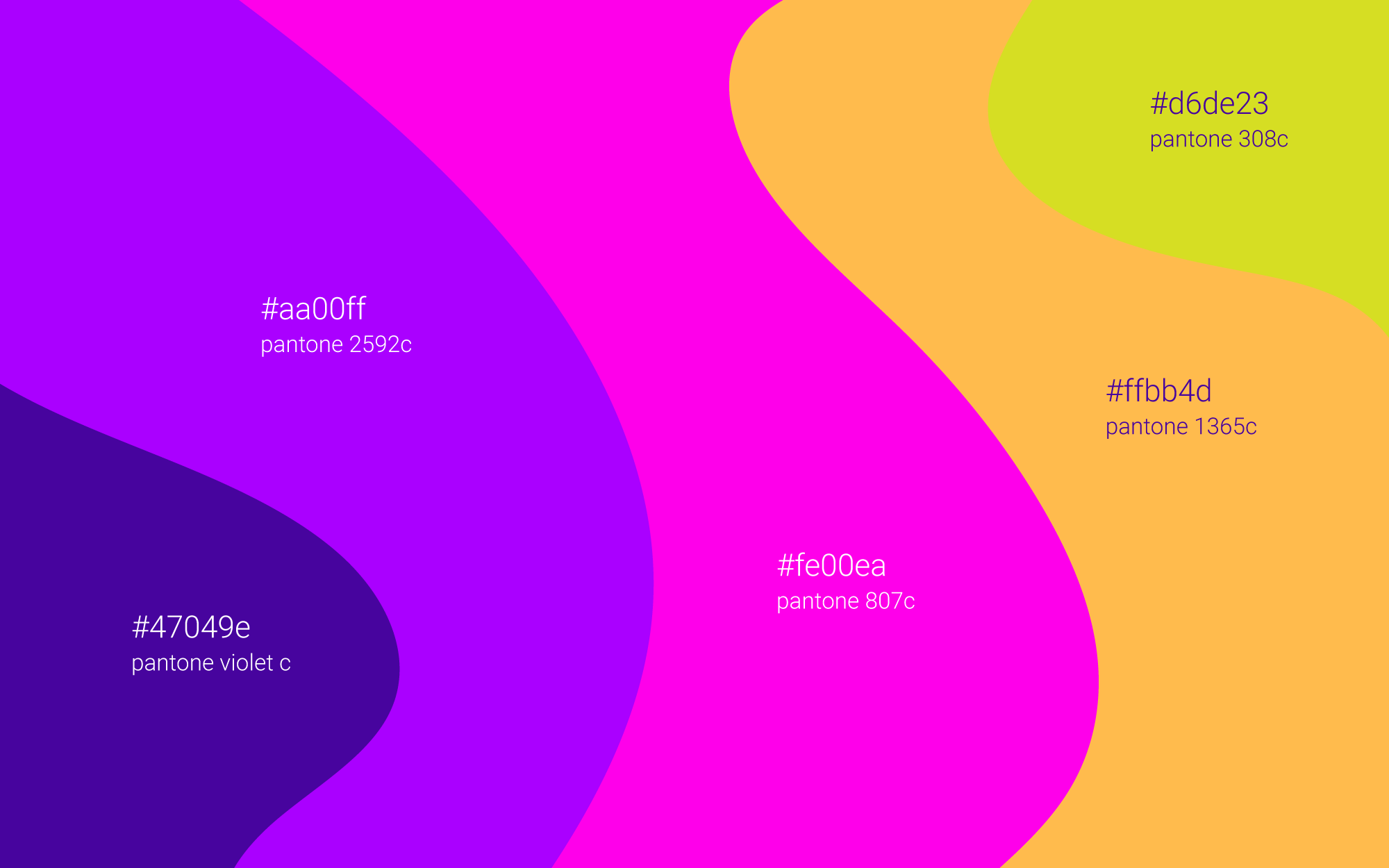
Colors
Color plays an essential role in every corporate identity program. The colors below are recommendations for various media. Consistent use of these colors will contribute to the cohesive and harmonious look of the Soniq brand identity across all relevant media.
Soniq Stars
Now, as for the Soniq Stars, we felt that the most humble and honest symbol to use is, well, a star!
Applications
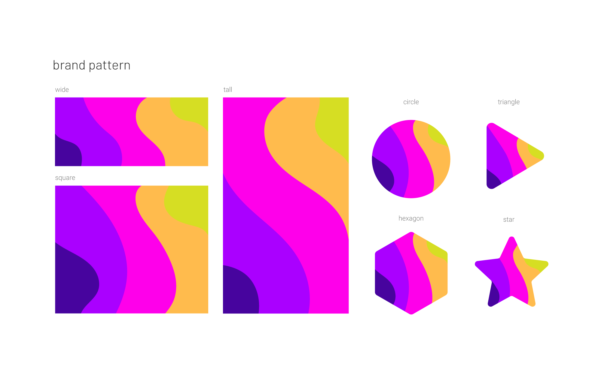
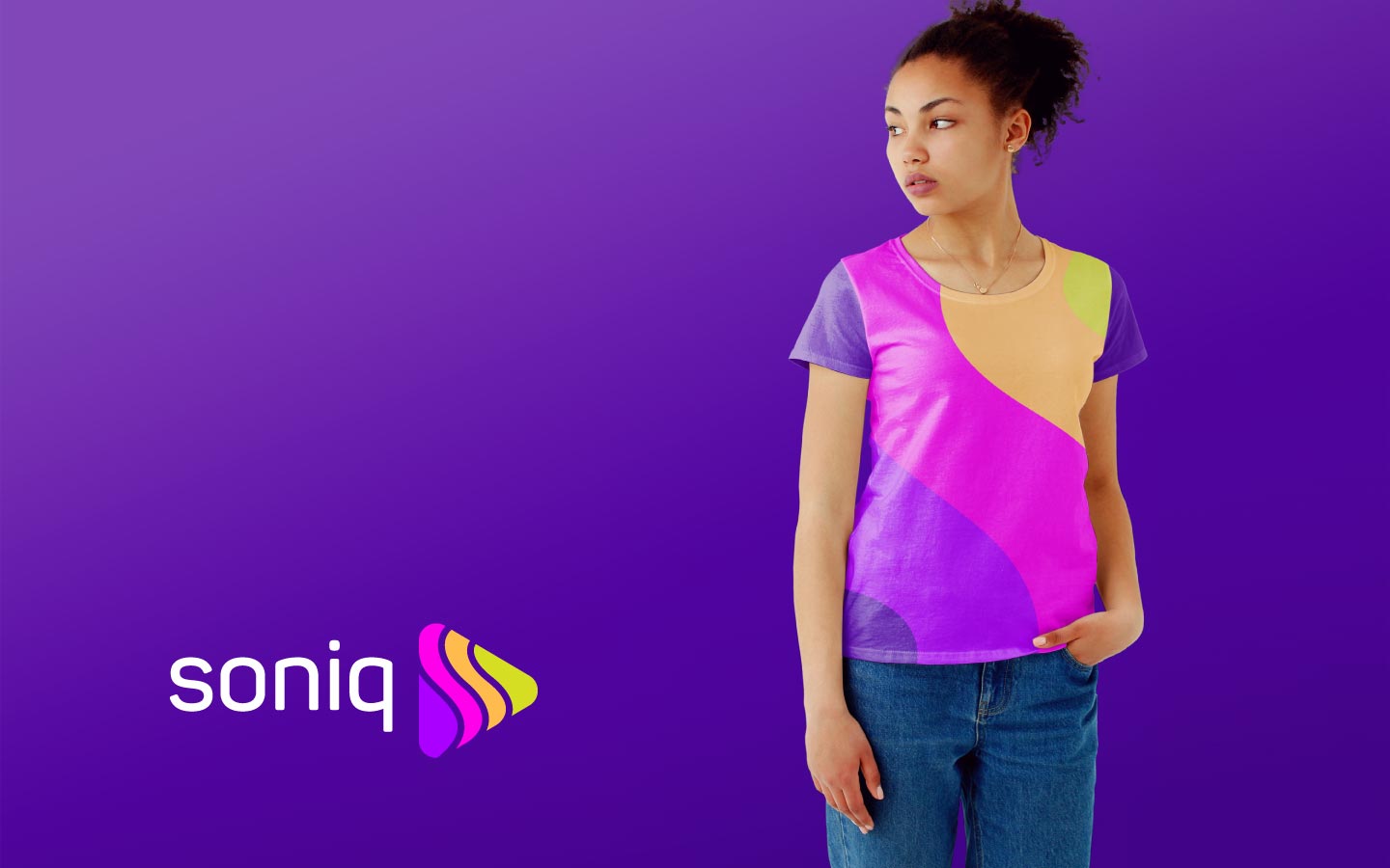
We also defined additional brand assets and applications such as brand pattern system, photo style, stationery, and apparel.
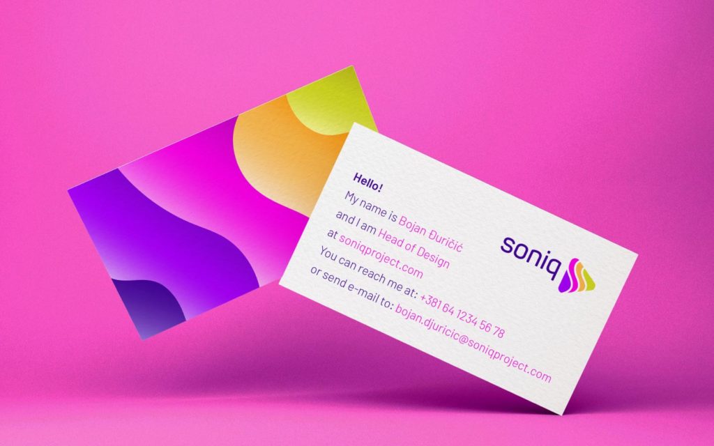
Soniq business cards 
Soniq brand pattern 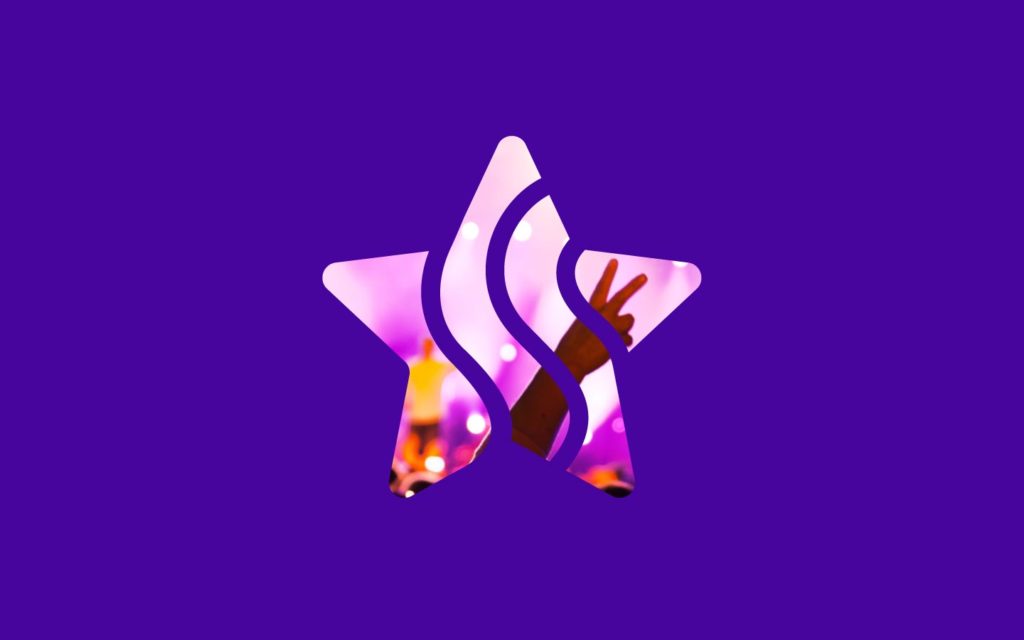
Soniq stars icon 
Soniq image style1 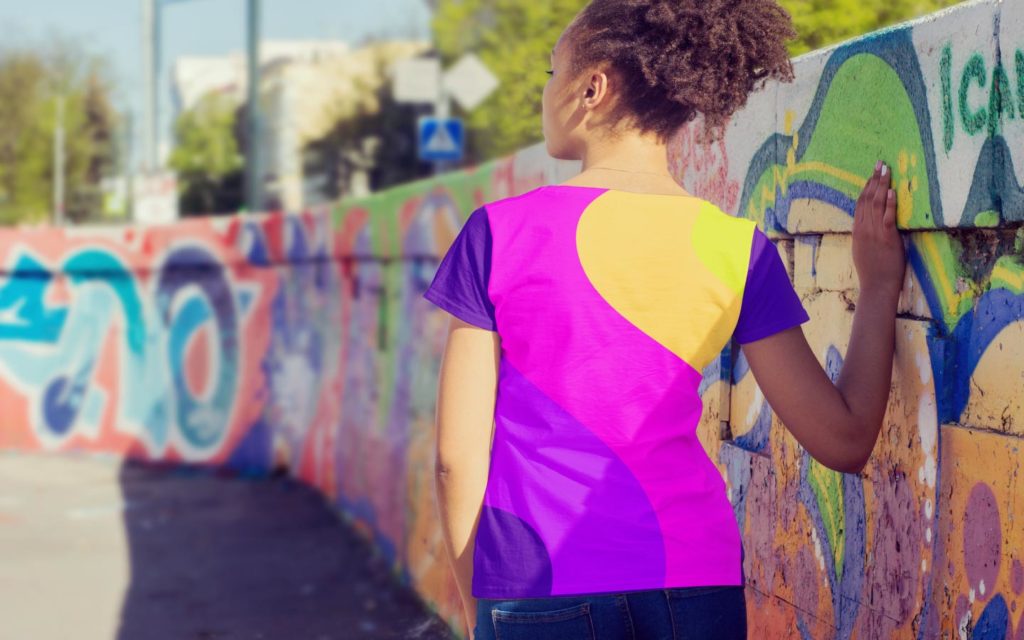
Soniq image style2 
Soniq image style3 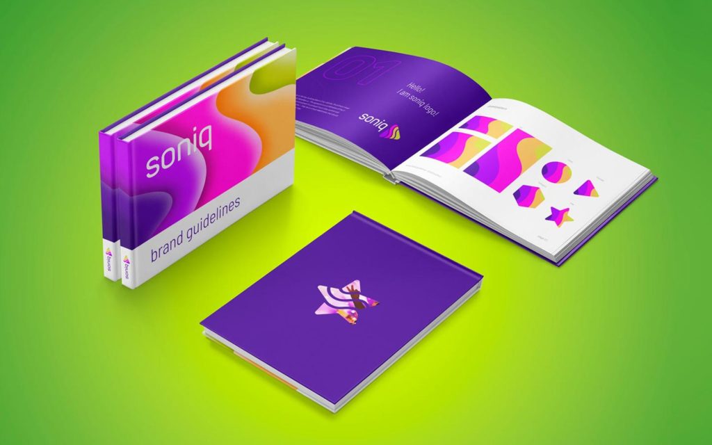
Soniq brand manual 
Soniq image style5 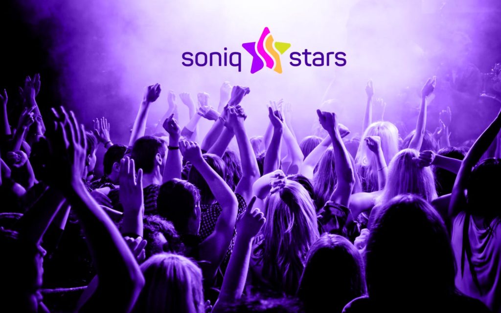
Soniq image style4