Content Insights
Next-generation content analytics
Brand identityBrand manualBusiness cardsLetterheadLogo designPrint production
Objectives
Studio Logoholik was tasked to create a visual identity and brand manual for Content Insights – the editorial intelligence package created by editors.
Proposed actions
The logo redesign process’s initial goal was to make it a bit more grown-up. It needed to portray the right message and make it not stick the wrong way 🙂 when viewed with client or competitor logos while maintaining the company culture and voice style.
It also needed to be more usable and scalable in different applications (horizontal/vertical, standalone icon need to be more recognizable, etc.)
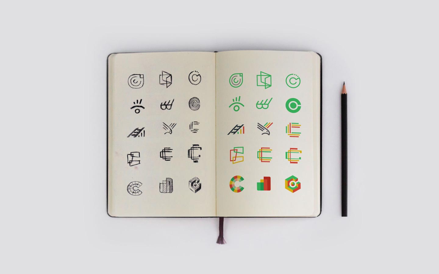
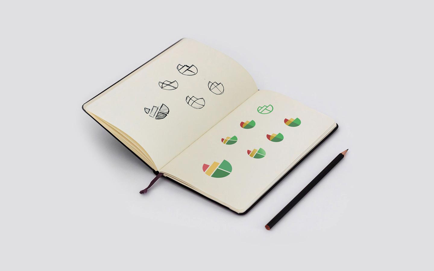
Initial logo exploration
This exercise’s idea was to cover several different possible paths – some of which a bit straightforward and some bolder ones.
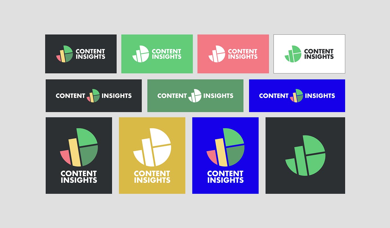
After a lot of consideration, the decision was to go with a toned-down logotype set in Futura font, working in balance with the icon – an abstract ci monogram constructed using the essential element of the old logo (bar graph), transforming it into a dynamic pie chart.

Content insights horizontal logo inverted colors 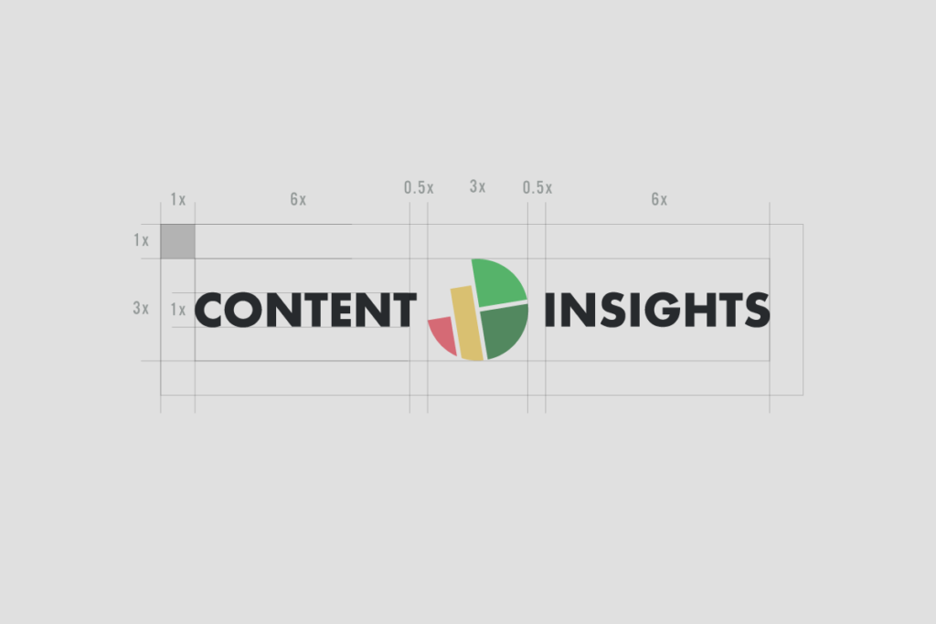
Content insights horizontal logo construction 
Content insights horizontal logo two colors 
content insights 
Content insights primary logo 
Content insights primary logo construction 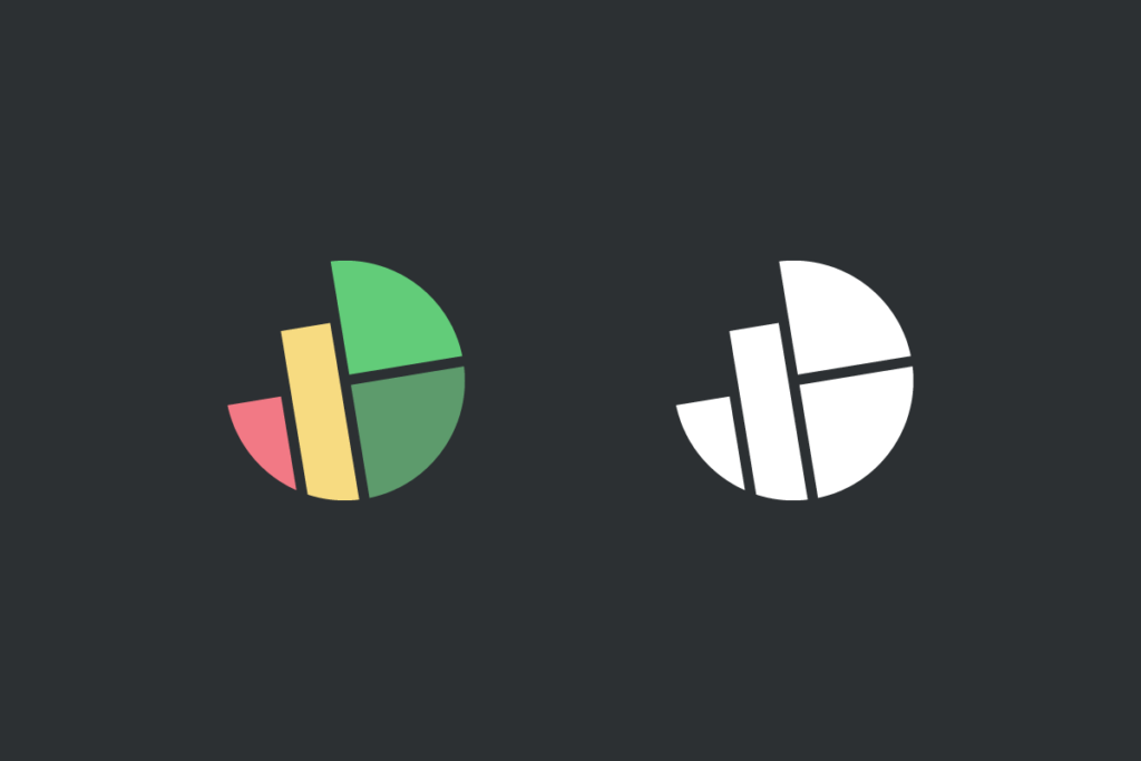
Content insights icon avatar inv neg 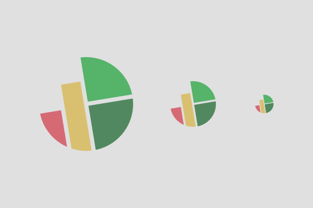
Content insights icon avatar

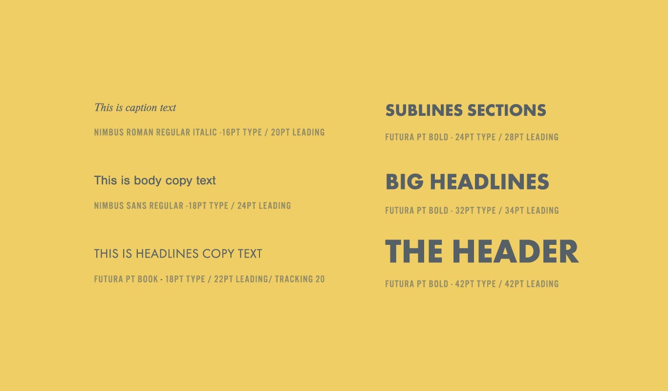
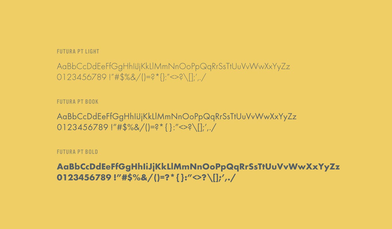
Typography
A well-proportioned, clean font can make all the difference on a website or even a corporate flyer.
Good typography creates that “There’s something about that” feeling in people’s consciousness.
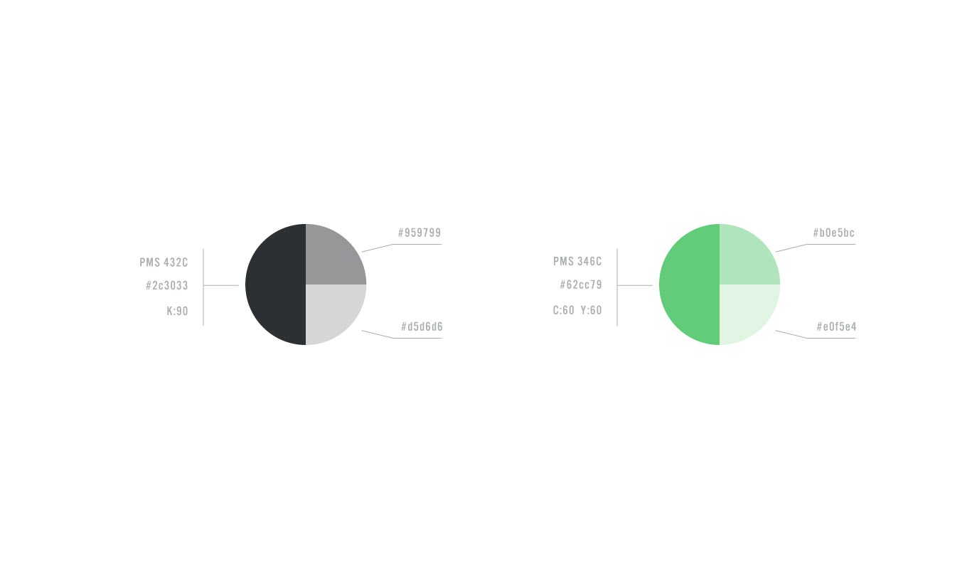
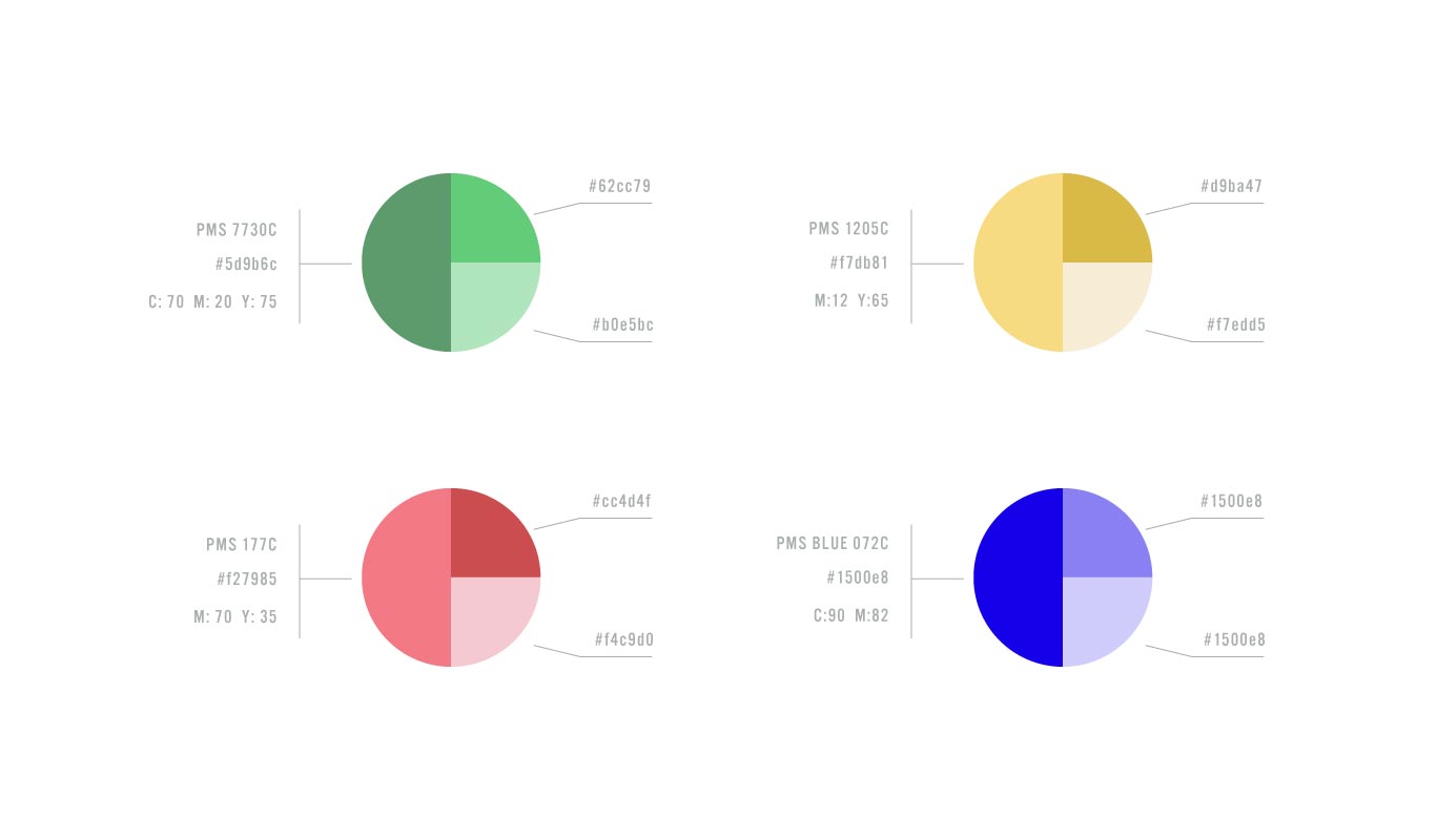
Colors
Color plays a vital role in every corporate identity program. The colors below are recommendations for various media.
Consistent use of these colors will contribute to the Content Insights brand identity’s cohesive and harmonious look across all relevant media.
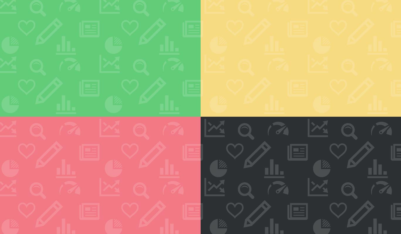
Brand pattern
Patterns create interest, texture, balance, and extra special touch that flat colors can’t give you.
They support the brand message and reinforce branding through consistency and recognizable elements.


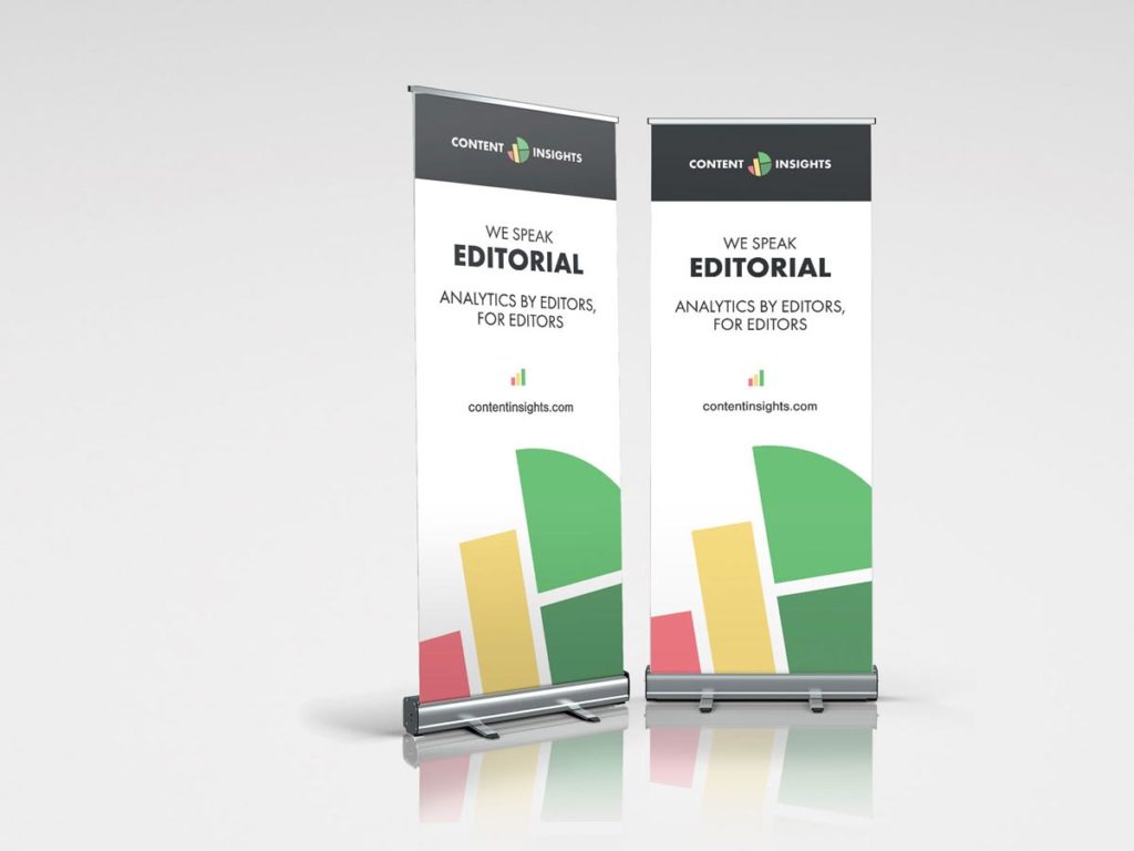
Content insights roll up 
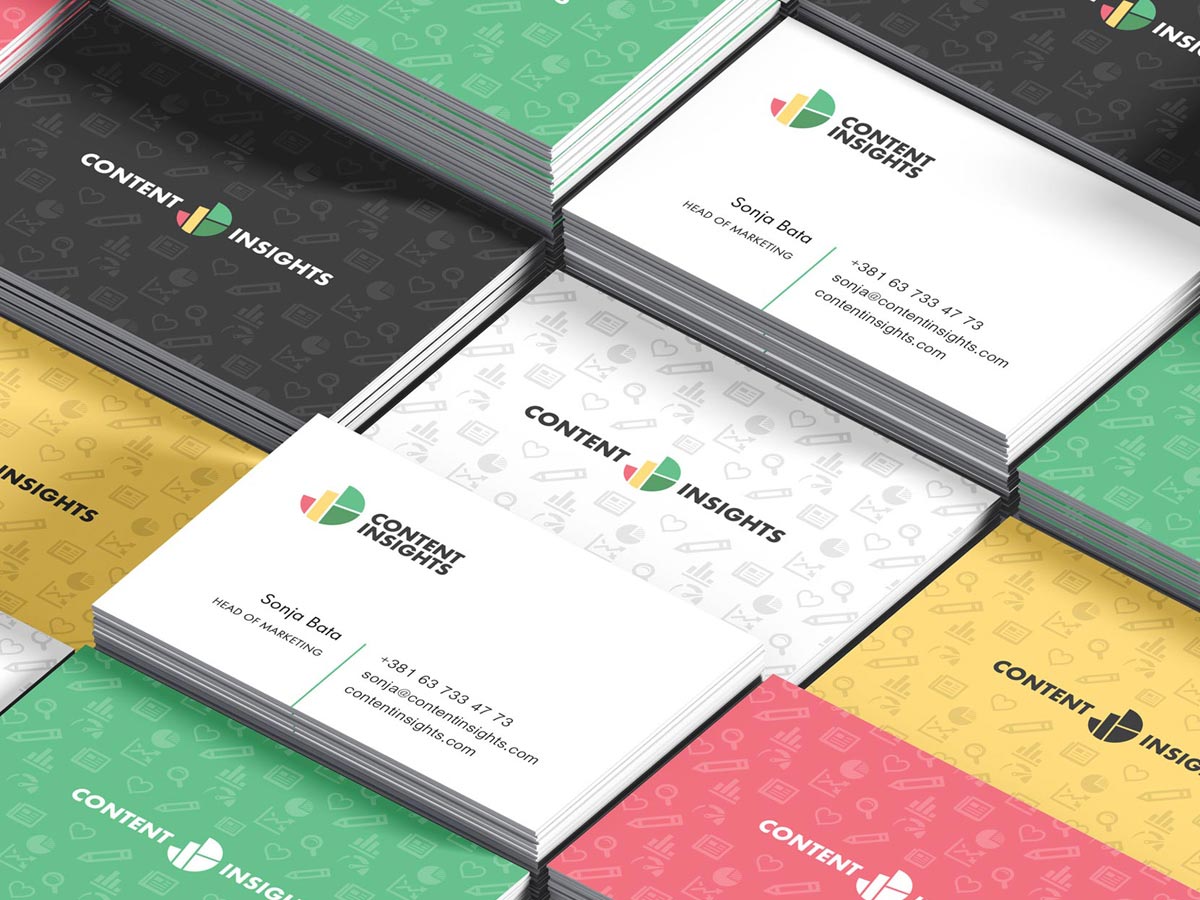
Content insights business cards 
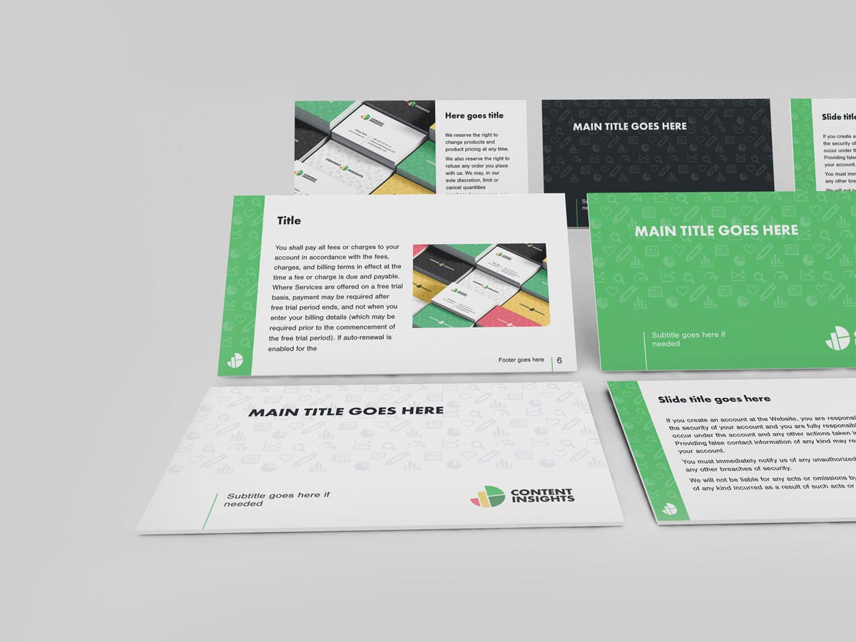
Content insights ppt template 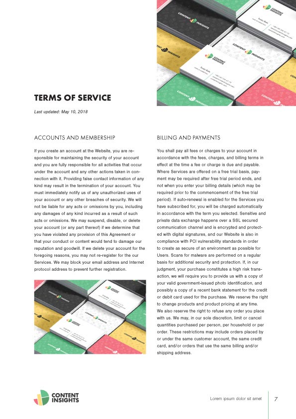
Content insights a4 spread1 
Content insights a4 spread2 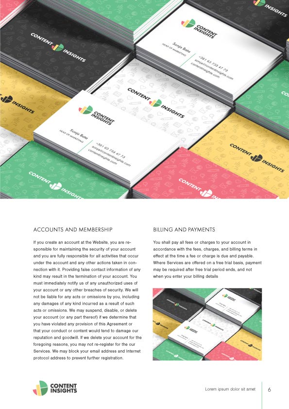
Content insights a4 spread3
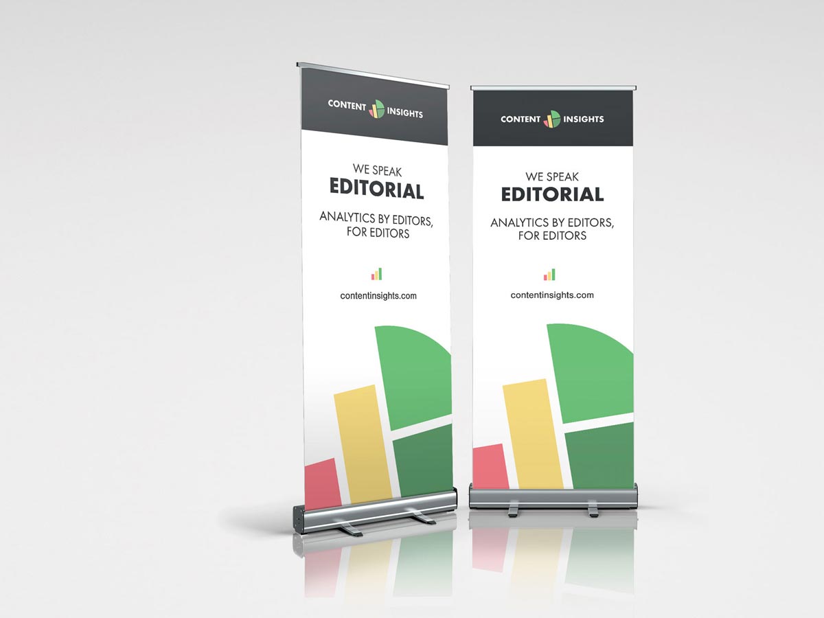
Applications
After we successfully defined core visual elements, we produced a set of brand assets and applications, including business cards, letterhead, PowerPoint templates, and created the overall look of A4 spreads.